Monday, 28 November 2016

Production Diary - Week 7- Clip selection and Beginning to Animate

This week due to being at the Manchester Animation Festival, I haven't had the opportunity to progress much on the production side of this project.
One thing that I have been able to focus on is the making decisions on which live action clips will be most appropriate for the animation and which clips would fit together more fluidly, taking into account resting facial expressions and reactions of the two characters when engaging in dialogue.
It is important that I pick out the most fitting sections of footage for each section of dialogue in relation to each other, when it comes to actually assembling the animation and applying the footage to each animated scene, I may have to change my selection of a given section of footage to make for a more fluid final edit - this could be due to certain sections of footage being too short or the facial expressions changing too quickly.
At the end of this week I created the first animated elements of my main scene in after effects, I also added some blur affects and drop shadows to give the scene more of a depth of field and elements of parallax.
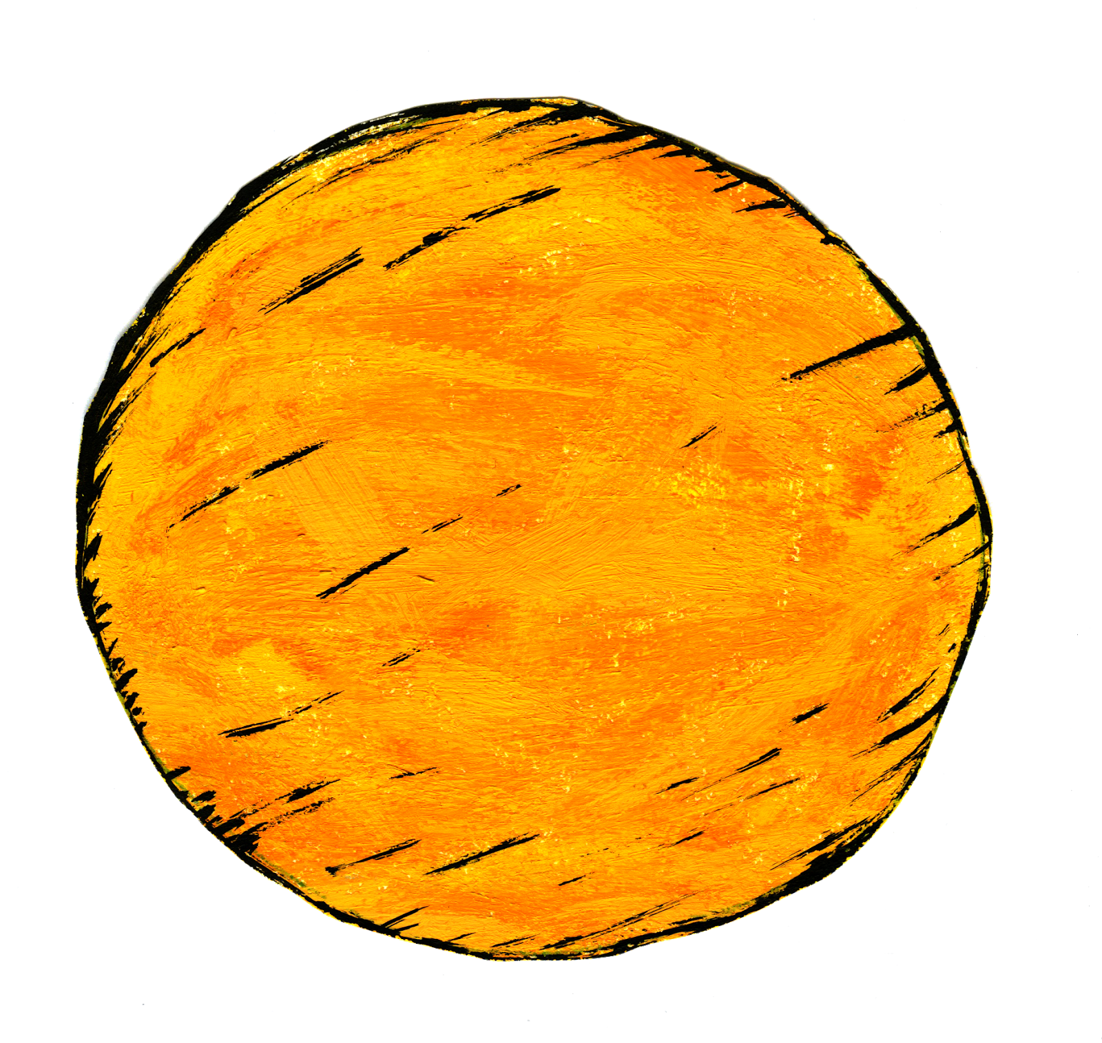
The first element of motion that introduced into my scene was the sun and its rays rotating round the the main body of the sun. To do this I made a pre composition in aftereffects of the four sun rays and key framed the rotation of the rays around the sun by placing the position of the anchor point in the centre of the sun. I also key framed in different values of scale to make the rays look like they were growing and shrinking/ glimmering for want of a better word.
To give the sun a better sense of believability I duplicated it and the the rays' layers and used the blur effect to give them somewhat of an outer glow.

Screenshot showing the camera in conjunction with 3D layers

To give the scene a sense of parallax, I converted all the layers into 3D layers and added a camera to work in conjunction with those 3D layers that could be zoomed in or out on the Z axis, up or down on the Y axis and left to right on the X axis. The point of interest may also be moved around to give the scene even more of a sense of cut-out-handmade-ness that seems to be the direction of my work so far. The benefits of using the camera were that I was able to keep the same scene and frame each shot by moving the camera around the scene and zooming in and out accordingly, rather than having to make a new composition for each close up shot.


production diary - week 6 - reflection

 - this week production has had to be put on hold due to illness -

As i was ill this week i was unable to focus properly on further production of the animated short, however this time did offer me chance to reflect on the progress that i have made so far and what the next steps should be.
I am pleased with the way that the world that the characters will play a role in has come together, I had preconceptions of the scene looking very jarring and not really having much about it in terms of believability, however by developing the drawings digitally I have been able to bring more warmth into the colours and bring out the brushstrokes in the thick acrylic paint that give the scene that element of homemade-ness and child like sensibility and playfulness that I was aiming for.
The footage of mine and my course mate's faces and dialogue has turned out well, the adult nature of the conversation/approach to the dialogue carries with it a dry sense of humour that i think will juxtapose well with the whole childlike aesthetic that I am trying to carry across in the physical/drawn elements of the world that i have created for these two rival characters.

One change that I will make to the original idea of having two different looking flower characters is that i am going to have the two characters looking relatively similar. The reason for this is that i believe the more adult sensibilities in the dialogue between the two characters should distinguish that they are in fact two very different characters in they're personal traits, yet because they are so similar there is this element of jealousy and competitiveness that arrises and results in the two becoming rivals.

Sunday, 27 November 2016

Production Diary - week 5 - filming and acting

This week I did not make a lot of physical progress on the production of the animation, however I did produce numerous video edits following the script, I decided to produce numerous edits so that Me and my course mate Tom, gradually became more comfortable with the lines so that they seemed more natural in their delivery.

There were some practical aspects of filming the live action parts of the animation that I did not at first fully consider. The lighting and sound were major factors that I had to find ways of controlling, the first consideration about the lighting was how the subject's faces should be lit up - I thought to include as much detail in the face as possible the lighting should be flat and equal across the subjects' faces. The reason why the lighting has to be flat across the face is to bring out the facial expressions more which help to put more emphasis on the dialogue that is taking place and the attitudes of the characters on screen. Another reason that the faces needed to be lit up in such a way is so that the values of light around the face were equal so that they would be easier to mask and blend into the character's body.

The audio on the first few cuts of video was very poor, I then decided to opt for a Rode microphone to be attached to the camera for a better quality of sound. The audio that was retrieved was marginally better, it had a fuller sound to the dialogue being recorded - however the microphone also picked up background noise and slight reverberation of the room that I was filming in. What I shall do to rectify and improve the audio quality for the final cut is to use the graphic equalizer in audition to remove as much background hiss as possible. In addition to this I will mix in with the dialogue atmospheric noise relative to the world that my narrative takes place in (e.g. the wind blowing, birds tweeting etc), I have some footage archived of the countryside that may prove useful for this area of the project.

Wednesday, 2 November 2016

Character & Narrative - Research - Aesthetic

For my animation I want to have a child friendly aesthetic with adult characteristics to make juxtapositions between the two, to help build a better idea of how to do this i have been looking at shows and animated shorts such as The Mighty Boosh, Luxury Comedy, 'Dont Hug Me I'm Scared', Pib & Pog. I have also been looking at sketch shows and sitcoms such as, The Limmy Show and Peep Show for they're sense of humor and wit and also a reference to take inspiration for the acting that I will have to carry out for my animation.
One of the ways in which i think these animated shorts and programs put across this child friendly aesthetic is to use bright, warm colours to invite the viewer in, they also i think consider the audio very carefully - using sounds that are soft on the ears, sometimes with melodies made using instruments you would often find in a nursery xylophones for example - Pib and Pog use a melody that is reminiscent of some nursery rhymes.

Pib and Pog even make use of letter blocks that children often play with for the title scene of the animation -


I think the typographical choice within my own animation will be an important decision as this will be the first thing my audience engages with and will set the mood for the whole animation - much like this opening scene of Pib and Pog does - so i will have to carefully consider the typography on the title scene to get across the child friendly tone of voice, as i am not sure that the colours and medium alone will be able to project that to the audience.


Production Diary - Week Four - Scripting/Screen Play, Storyboards and More..


(There are more assets, here are just a few for example and documentation purposes)


I have scanned in my acrylic paintings of objects to be placed in the garden scene of my animation, these are to be used as assets, I chose to paint my the scenery/environment of my animation by hand in thick acrylic for some interesting textures that would have been difficult to produce using digital means. Once scanned I opened the images up in Photoshop, removed the white/paper background so that the object was on a transparent background by using the magic wand tool. I then adjusted the levels in the image-adjust toolbar, this helped to bring out the texture of the brush strokes and added warmth to the colours - this is important if I am to keep a seemingly child friendly aesthetic (needs to be inviting).

Mood board -


above is a mood board featuring some animated shorts and feature films which I feel have the same aesthetic qualities of children's TV programs yet, subvert this/ make juxtapositions by having adult themes within the delivery, dialogue and action.
Pib And Pog is a good example of this juxtaposition, as on the surface of the animation the characters are very inviting and friendly looking with the narrator using a child friendly tone asking each character questions and reacting with a light hearted response to quite graphic violence between the two characters.
I also decided to include luxury comedy on the mood board for something to take reference for image tracking on after affects where certain assets follow the features of a face superimposed into an animation, this would help to further combine animation with live action film.

Progression of script - The script is finished however it is only short, it may need alterations depending on the cut of the live video,

Storyboard - This is the first draft of a storyboard for my animated short, from this I will be able to plan out better how long each shot will last and what audio will be played at each point e.g. dialogue, birds tweeting etc. The typographic choice on the first still of the storyboard is not necessarily the choice that will be final as I may choose to create my own text using acrylic paint as this may be more in keeping with the aesthetic of the whole animation.
In some of the shots on the storyboard - noteably the close ups of the flowers I have added a blur effect to the green hills in the background of the scene and aswell to the shed, this helps to pull focus into the two character's faces and gives the scene more of a sense of depth. These creative choices for the storyboard will help inform the work my post-production phase.


Now that the storyboard and script is finished I am able to start producing the cuts of live action video to be included in my animation, once one rough of live action video is produced I will then be able to use the audio from that footage to put it alongside the visuals of the storyboard to produce an animatic.