Tuesday, 21 February 2017

Applied Animation - Animated documentary - weekly diary - week two

Quick GIF of a sample of the sketches..


This week to gather more primary research (sketches and interaction with the public) we visited various places around leeds with a different setting for each.

The first place we made a visit to was the Henry Moore institute art gallery, here we took sketches from and spoke to the curators of the gallery about the types of people that are most likely to visit the gallery. What we found was that the curators experienced visitors from all walks of life and there wasn't really a specific type of person to visit the gallery. This made me wonder if this view is actually true or if the case is that the curators weren't all that critical in they're analysis of the people that visit the gallery based on the way they look.

Next we visited a series of record shops, the first being jumbo records. What we learned from the shopkeep at jumbo was that he, as somebody who works at a record shop is able to look at a person as they walk into the shop and have a rough idea of what a person might be into in terms of music, this brought about the thought that music has a lot to do with identity and sense of inclusiveness.

What I learnt by speaking to the shopkeeper at Relic records was that he too would easily be able to make assumptions as to what a person may ask for in terms of music based on their appearance, he also said that although the store caters for a wide range of musical interests, what he himself has noticed is that there are a growing number of female customers visiting the record store where once the store would have been frequented more by male customers.

When we visited crash records, it was a very similar story to what the rest of the record shops had told me, and I think that this is a link that I should carry through into my secondary research by looking at subcultures and the music that is associated with them.

Sunday, 12 February 2017

Applied Animation - Animated Documentary - Weekly Production diary - Week One

This week an idea for this animated documentary was formed under the theme of SCIENCE, The idea aims to look at stereotypes and how people perceive oneself under certain circumstances, this could be the environment, personal bias. The practical aspect of the idea involves gathering primary research via going out into the public and gathering portraits from members of the public, whilst simultaneously asking them questions of what they think of our personalities based on just our physical appearance.
From this we aim to use the portraits to produce a morphing animation of each others faces. Once the research has been conducted we shall make an audio commentary on what we discovered about the public's preconceptions about the type of persons we may be just from our appearance - this will then be animated to with a character of our own design.

FIRST CONTACT -

On Thursday of this week I was at a fundraiser event at the Brudenell Social Club of which I had contributed to by selling one of my own designs as a T-shirt. I also had with me my A6 sketchbook and so felt like this would be a good opportunity to begin with some primary research. The demographic was largely made up of students and young people - this was due to the fundraising event being put on by the Leeds Student Radio.
With the atmosphere being relaxed it was easy to find people willing to contribute to the project, when i approached people i first said that the portrait was to be part of an animated documentary and I was unsure whether or not this had any effect on how the people participating perceived us.
What did have an affect on how people perceived us or how they said they perceived us was that i noticed if the person who was getting there portrait drawn was stood further away and could not see the reaction until later - the participants were more honest about their preconceptions of the person they were drawing. This may be a problem that we have to overcome by different 'interview' tactics, e.g asking the participant to draw one of us from a far whilst they think they are not looking.

Overall I think that this first taste of primary research has left me feeling positive about future work on this project, I may also try to bring my sketch book and a pen with me to places that are busy yet have a slightly different demographic.


Friday, 3 February 2017

Responsive - Roald Dahl - George's Marvellous Medicine 2

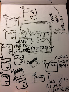
 To left the image contains sketches of layout plans, the character, cupboards, shelves and its contents had to be laid out in a way that it appears to be some sort of pantry in my mind, I think this idea is also relative to the story with a little boy mixing ingredients from his parent's kitchen/ pantry etc.
 Here on the right is the final sketch which i then developed digitally as you can see below. I was sure to take note of the different qualities of line and their thickness to give the image a sense of depth.


For the colours in this image I opted for primary colours for the character and other elements so that they would jump out against the darker background - which i also added texture to using the brush tool to be in keeping with the aesthetic of the rest of the images.

I am pleased with this illustration, I feel that there is movement suggested within it - perhaps due to George being clumsy and knocking the bottles and jars around on the shelf.

Responsive - Roald Dahl - George's Marvellous Medicine 1

Again for this illustration, the last in the series of three, I had to come up with a simple composition that would translate the scene in the novel whereby George is in the process of making a medicine.

The way I thought I thought i would do this would be to include lots of ingredient bottles and show George reaching for them and mixing them together.

The only creative problem that I ran into whilst trying to think of composition that would do this was thinking how to arrange each element.


The image below documents the idea that I took forward to the End design, It shows George on a stool reaching for ingredients on heavily stocked shelves. The character's face has a sense of concentration on it as if he is straining to reach up at a jar, something that i feel is quite relevant as George is a small boy.


Here below I was contemplating and practicing what the shape of George's Head should be.

Responsive - Roald Dahl Illustrations - Mr Twit 2


Above is the original Idea I had for a finished piece of Mr Twit Using found photographs for texture, however this technique i feel would not fit in with the rest of the series, due to the texture being digitally painted on in the first illustration.

For effect and a reference to the description that Roald Dahl gives of Mr Twit i included Bits of food in his beard, colouring them brightly and including a comical fishbone in there as a signifier as to what those bits actually were in his beard.

With the painted textures I mimicked the colours found in the textural tweed and wood photographs, also adding some darker colours to the background to give the impression that his surroundings are grubby and unclean, much like the description the reader receives when they read the book.

Responsive - Roald Dahl - Mr Twit 1


Here I was trying to think of a simple way of portraying mr twit that would fit in as a cohesive series with the grasshopper illustration - as i am documenting this work in the chronological order that it was done in.

The way I would symbolise a scene from the Twits novel, would be to use the part of the novel provided in the sample pack which describes Mr Twit's appearance and eating habits.

For Mr Twit's appearance I made use of blocky features and simple lines to act as his facial features.

At first I had concerns that this style of drawing for Mr Twit might not be appropriate due to his messy nature.


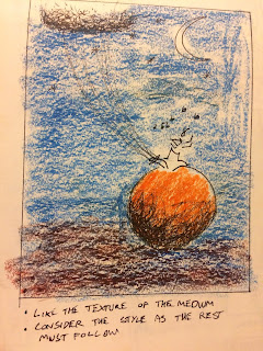
I experimented on on textured paper to get some kind of an idea about the texture that should be applied to the beard and hair, also his clothes and surroundings.

Responsive - Roald Dahl illustrations - Old Green Grasshopper 3


This illustration was the final non colour draft of this particular scene. The composition works well I think because I have managed to include all of the elements that I wanted to during my development phase of this illustration.

I opted to keep the composition very minimalist and thought about this carefully as the brief asks for the series of illustrations to work as a set - so I would have to carry this through into the other pieces that were required by the brief.

The brief also asks for something that would compliment the roald dahl literary state's logo, so I felt this simple design with fairly bold line work would really befit the logo when combined with bright enticing colours.


This image here Is the final design, I opted to add in texture to the image as it looked very flat and I did this by using a dabbing brush texture and layering up the colours using the photoshop layers.
I also opted to use very bold colours for the musical notes as a slight nod to the Roald Dahl logo.

I think think that as first illustration for this series I have done well to consider that the 3 illustrations must appear to look as if they are part of a series. I have carefully considered this by making sure that each of the approaches that I make for the other characters are similar to each other - e.g bold lines, simple composition and textured colours.

Responsive - Roald Dahl Illustrations - Old Green Grasshopper 2


Moving on from cropping the peach I decided to come up with a composition that would include the whole peach and show it being tethered to a flock of seagulls, whilst the Grasshopper plays music as James  listens.

This design i think worked well, however this design made my deliberations over the character designs of the grasshopper in vain.

It was at this point that I realised that I would have to create a composition that incorporated all of the elements that were important to the illustration of the scene being recognised easily by a young audience. The composition would have to include in it the peach in its entirety, the grasshopper and some sort of musical reference - a musical note for example.
Having kept this in mind I went back and revised my ideas and made sure to include the design of the grasshopper in the next couple of ideas that i would draft up.

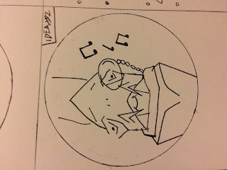
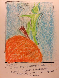
This design was the first to incorporate all of the important symbols/signifiers, with the circle representing the peach, the grasshopper playing the violin and the musical notes.

However I feel like I may have overcomplicated the design by including the violin - or moreover what I have tried to imply is the violin, it isn't very obvious.


This was the template design that I would eventually bring into my final design. I think it works well as the character is clear and easily recognisable as the old green grasshopper.
Next to this sketch were notes explaining what the rest of the composition would be made up of.
The circle would be orange and the grasshopper green, At this point I was unsure wether or not i would include texture in my composition.


Thursday, 2 February 2017

Responsive - Roald Dahl Illustrations - Green grass hopper

Starting this brief I read the mandatory requirements first off and went from there. The brief asked for a series of illustrations depicting scenes from Roald Dahl novels. The brief requests that there be one child character, one villain character and one fantastical creature from any of Roald Dahl's children's novels. 

  I began researching which novels I felt had the best characters for me to illustrate in a scene. I felt that the best characters for me to illustrate would be those that are more well known and that have with them certain objects that could be symbolic representations of scenes in a given novel.

The novels that I decided would have the best characters and scenes to illustrate were as follows; James and the giant peach - fatastical creature, Mr Twit - Villain character, George's Marvellous Medicine - child character.

For my 'fantastical creature' character I chose the Old Green Grasshopper of james and the giant peach. I began sketching out ideas for the character first off by using a very loose expressive technique - similar to that of Quentin Blake the Illustrator of many of Roald Dahl's novels, I did this because i wanted to make my work to befit the brief and the Roald Dahl's key demographic. I felt that a looser illustration style might work better than something that is more composed due to it having a more playful approach to it.

 As this was only an experiment I moved on to experimenting with a more considered approach. What I think did not work well with this loose experiment is that it doesnt encapsulate much of character that we find when we read the book or watch the film adaptation of it.

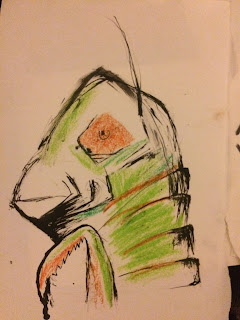
This image is the second experiment using a more considered approach to line and defining the features of the face, whilst still being loose in the application of colour. With this attempt I felt like it was an improvement on the depiction of the character in relation to his apparent candidness and approach-ability in the story. However i was still not satisfied with the composition of the different parts of his face - it felt too busy and difficult to understand what each feature was, especially to a younger audience.


This Next image Is the character design that I would bring through into further developmental work as i think that it is not over complicated and the features are easily recogniseable.


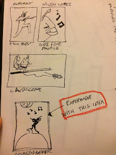
Whilst developing how I would envisage the character I was also concerned how I might depict a scene from James and the giant peach. An idea that came to mind was to show the scene where the grasshopper is atop the giant peach and playing music whilst James listens.

This idea really stuck in my mind and I felt that it would really be a recogniseable scene to have illustrated from the novel.

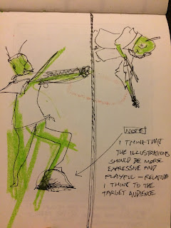
I experimented with putting the character in different poses playing his instrument, trying again to incorporate a more expressive approach to bring out a more natural stance - however this was not what was achieved due to being out of practice with figurative drawing.


The sybolic element of this illustration would have to be the giant peach. So I feel i was right to be concerened how i put this across to the audience. I thought about having the peach just out of full view showing the stalk as a signifier for what this big orange thing could possibly be.

I then decided that this idea would not be obvious enough/ would not communicate very well the scene that I was trying to illustrate.