This piece of work was produced as part of a collaboration between myself and leeds college of music student. The premise was to create some form animation/visuals to be projected and have music played alongside in an installation type setting. Unfortunately due to other commitments work on this project has been put on hold for now.
Thursday, 10 May 2018
EXTENDED - PORTFOLIO BUILDING - COLLABORATION WITH LCOM STUDENT
This piece of work was produced as part of a collaboration between myself and leeds college of music student. The premise was to create some form animation/visuals to be projected and have music played alongside in an installation type setting. Unfortunately due to other commitments work on this project has been put on hold for now.
EXTENDED - FINAL FILM PRODUCTION - INITIAL PHASES AND WORK STRATEGY
Due to having mapped out the and fleshed out how the film might look at each point using tumbnails, it was at this point that had decided that I needed a list of all the assets that needed to be created for each scene. Having this list enabled me to have a clear idea of what needed to be worked on each day.

Slowly progressing through the list I was able to piece together each scene in a static form.


Building up each scene with the finished assets in a static form and enabled me to concentrate on the composition of each scene also.
Once each scene had been built up, it was then time to record the poem for the film so that the assets could then be synced up and keyframed.
EXTENDED - FINAL FILM - MEDIUMS
To keep production time as sharp as possible and for a more streamlined work flow I have opted to use TV Paint for alot of the assets used in the animation. As my animation has within it alot of varied shots and scenery, it makes more sense to create most of the assets in one place - rather than creating all of the assets by hand and scanning, editing and manipulating using adobe suite.
I have also found that the variety of the brushes and the versatility of tv paint to be very useful in achieving a child like approach to image making, something that I have utilised to make reference to my own childhood which is a theme that runs through the poem in the animation.
Despite using TV Paint to create most of the assets in my film, I have used paper based mediums to create some of the backgrounds and assets, this has resulted in a multi media collage effect that in turn shows my versatility in working with a range of different mediums.
EXTENDED - FINAL FILM - MOOD BOARDS


These mood boards use images that describe the basis of the sense of nostalgia that I am trying to get across in my film. They also include garish colours which will be an aspect of the aesthetic that I will use in my film. Colour is a very important signifier in terms of the mood that is being put across through animation/film, careful consideration will be taken on this aspect in the production of the film.
Wednesday, 9 May 2018
EXTENDED - FINAL FILM - POEM

Thursday, 5 April 2018
EXTENDED - PROJECTION MAPPING BRIEF
For the christmas projection mapping brief, myself and tom decided that we would work on a video game themed projection and use simple bold shapes to create these animations. We decided that we would choose 4 games to emulate; pac man, tetris, mario and space invaders. these games would then be rendered in christmas themed attributes such as; christmas puddings, baubles and christmas trees.
I created the space invaders animation, and created the background and all scenery for the 'mario claus' animation. Because of the simple visual design rules implemented in arcade games, the design of the visual elements and how they moved was relatively simple.


I created the space invaders animation, and created the background and all scenery for the 'mario claus' animation. Because of the simple visual design rules implemented in arcade games, the design of the visual elements and how they moved was relatively simple.


EXTENDED - PORTFOLIO BUILDING - POSTER DESIGN/ ILLUSTRATIONS 2

I found this brief fairly challenging yet fun, as I was able to produce work relative to music and the performers.
I also learnt some new skills in adobe illustrator, which will be to the benefit of other projects that i am working with. The illustrations needed to be converted into vector graphics so that the quality was there for the posters that were going to be displayed online at lower resolutions.
The first step was to seperate each colour layer in photoshop using 'select, colour range', the two layers were filled and saved separately as .png's. These layers were then opened up in an illustrator document and image traced to convert the artwork into vector graphics.
All in all I am happy with the work that I have produced and I am confident that some of this work will feature in my portfolio.


EXTENDED - PORTFOLIO BUILDING - POSTER DESIGN/ ILLUSTRATIONS


I decided that this would be a fantastic oppurtunity to produce work that would be suitable for portfolio. And as there were 7 performers to produce illustrations for, the chance that some of these pieces could be placed alongside some of my best work was high. Also this brief was well suited to one of my strengths, that being character design.
I decided to use just two colours and bold qualities of line and shape so that when it came to digitally altering the designs the colours would be easily selectable and traced digitally.
EXTENDED - PORTFOLIO BUILDING - YCN KFC BUCKET DESIGN 2

For my second design i decided to opt for design that was a little more further away from the notion of 'family'. However what the brief also asked for was the design to be 'modern' and 'raise the kfc bucket to true iconic status'. So i felt what better way to make this design 'iconic' and 'modern' than to reflect the events that are happening within society today.
I chose to use this notion of space travel and discovery to reflect the developments surrounding the successful flight and return of the SpaceX shuttles.

EXTENDED - PORTFOLIO BUILDING - YCN KFC BUCKET DESIGN


For my YCN brief, I chose the KFC bucket design brief for the opportunity to create some character based designs.
The initial idea was to create a series of different themes for the bucket design and other applications such as facebook banners using animated GIFs etc.
The Brief wanted the design to be celebratory of some sort of 'family' hence the design being for the 'family bucket'. The word 'family' was open for interpretation and this could mean the people who you call your family - such as a musical family or a sports family or the people whom you work with.
I decided to opt for some designs that were musically themed to begin with and kept the designs simple yet making sure that there was a lot of action in each of the character's poses.
The idea behind this particular design is that there is a BBQ of some kind, which are associated with the gathering of family and neighbors, and the musicians are playing whilst waiting for the colonel's chicken.

EXTENDED - PORTFOLIO BUILDING - LOOPDELOOP - 'LOVE IS LOVE'
This was my submission for Loopdeloop in October, it was created relatively quickly using TV paint. It was also my first interaction with the software. I really liked the simplicity of the software and the textures that can be achieved through the various brushes that can be fully customised and appropriated to whatever project it is that you are working on. This animation would have been better if i had spent more time and care on each frame and perhaps the application of some sound would give it a little more life.
Monday, 26 February 2018
EXTENDED - VISUAL JOURNAL - COVER DESIGN

This is the front cover design of my visual journal/artbook. I opted for a design that would be eye catching and would reflect the aesthetic of the animation that is being produced. The off kilter design application of the text and the playful use of colour and illustration is meant to be a reflection of; the title (kids with kids), the literary content of the poem used within the animation and the deeper meanings attached to the content within the animation. I shall employ these off kilter design applications throughout the art book, to give the reader an impression of my professional voice/ approach to projects.
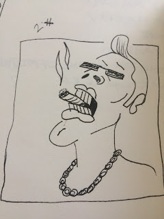
EXTENDED - FINAL FILM - EXAMPLES OF CONCEPT ART
The concept artwork that I have produced is a reflection of the aesthetic that I aim to strive for in my animation.
 These are character conceptual iterations that I felt I needed to include in my concept art and as a part of my visual journal. There may be variations in the way characters are designed, but this piece serves as a basis for the aesthetic considerations of characters. Line focused, simple and angular designs may be a prolific feature in character designs for this animation.

 These pieces of artwork were at times created without any guidance so far as any narrative is concerned but going back to the project rationale, the work that is being produced in this project is very much observational of things in my day to day surroundings and my own interpretations of situations that go beyond surface level.
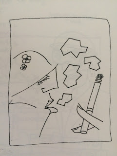
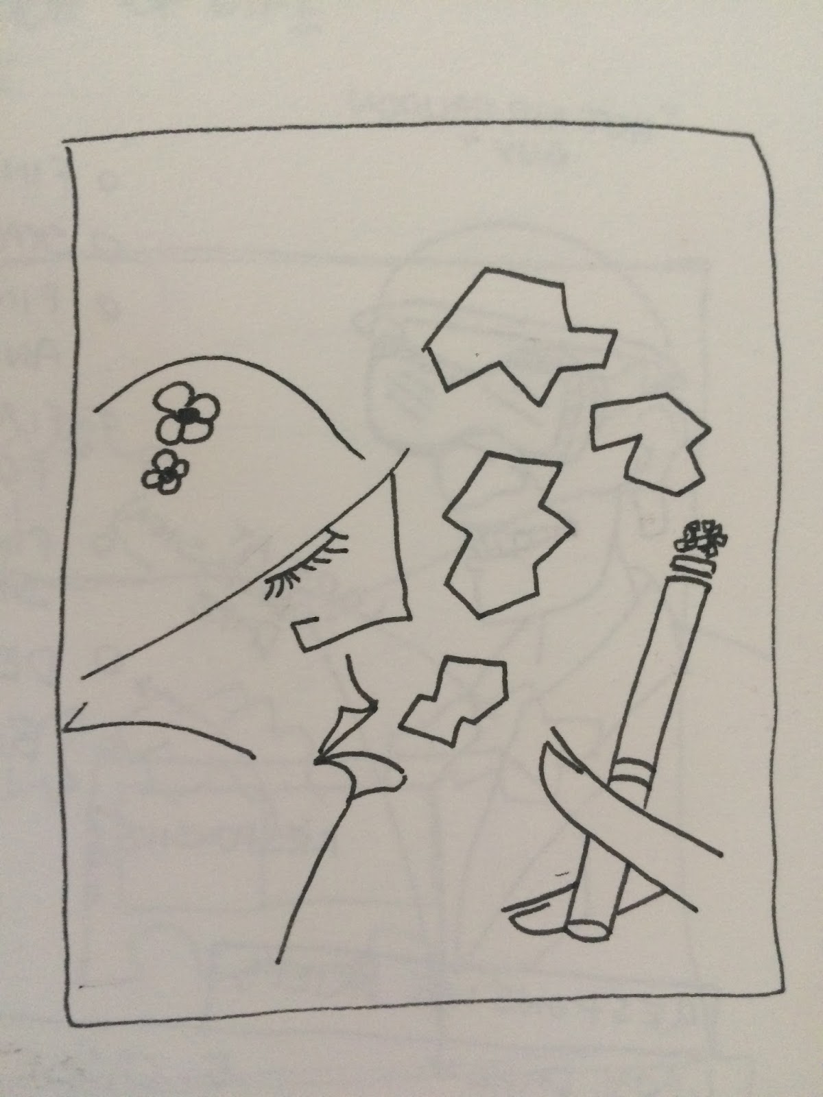
This piece of conceptual artwork is an example of work that has been better realized once the narrative of the animation has been produced.
There are elements in this piece - such as the speckled background - that will act as a 'puzzle piece' to the overall aesthetic of the animation.


 These pieces of artwork were at times created without any guidance so far as any narrative is concerned but going back to the project rationale, the work that is being produced in this project is very much observational of things in my day to day surroundings and my own interpretations of situations that go beyond surface level.
This piece of conceptual artwork is an example of work that has been better realized once the narrative of the animation has been produced.
There are elements in this piece - such as the speckled background - that will act as a 'puzzle piece' to the overall aesthetic of the animation.
EXTENDED - FINAL FILM - THUMBNAILING

Here I have been going through some thumbnailing, visualising what would happen in each scene of the animation according to each stanza in the poem.
There will be some adjustments to be made as try out the different iterations and see how they might fit together more smoothly.
EXTENDED - FINAL FILM - IDEA GENERATION/visual research 1

In my poem I conjure up images of penny sweets and fake sweet cigarettes that don't seem to be in shops any longer. This is where the nostalgia element of my film will come from, using the elements of the design aspects that can be found in old penny sweets and children's toys. Concept artwork in further posts will make reference to the aesthetics that can be found in these packaging designs.

There is a stanza in the poem that goes as follows and is meant to paint a picture of a car boot sale, a memory/ atmosphere that within me brings up a lot of nostalgia:
It were burger vans in car parks
It were crackin't flags
It were bouncy balls n lego bricks placcy bags.
I have collected imagery from the internet that I feel, when put together, gives a sense of the atmosphere and the scale of the bric-a-brac that was available at car boot sales.
Wednesday, 17 May 2017
Final Resolution
As it stands this is the final resolution to the brief, not completely refined yet but finished. I worked on the audio score to the animation using recordings of conversations I had with people from the pub - people who worked there and punters in general.
Tuesday, 16 May 2017
Weekly diary - Applied Animation - week 6 through to 9
This period of time was spent rotoscoping the frames for our animation. This was painstaking work yet rewarding seeing the finished outcome.
We split the total amount of frames 50/50 roughly amounting to 200/300 frames each.
The idea of representing ourselves on screen with respective art styles has had to be put to rest due to time constraints. And due to said time constraints it has been decided that the documentary will have more of a poetic aproach to the final resolve - something that encapsulates that environment of the pub - the place where our research into stereotypes has lead us.

Thursday, 27 April 2017
RESPONSIVE EVALUATION
Overall I think this module for me has been
successful and I have produced a lot of work for competition and live briefs.
My time management and being able to juggle multiple briefs and
responsibilities at once has been good, and I think that for this reason the
work that I have produced hasn’t suffered too much in terms of the quality – as
the quality of the work across all the briefs has been consistent. The same
could be said about the collaborative work that has been produced whilst
working through this module, time management and work ethic has been consistent
throughout.
Despite the quality of the work being consistent throughout the whole of this module I think that the work could have been a little better – there are some areas where I think that I could have done better if I pushed myself a little harder to gain a little more refinement to the finished article.
If I were to revisit this module I would have taken more time researchinhg and seeking out competition briefs that suited my own creative interests a lot more than the ones I have chosen – although this does depend on there being competition briefs that run whilst this module is set. And this is not to say that most of the briefs that I had chosen to produce work for didn’t hold any opportunity to pursue my own creative interests, it is just that at some points within this module I felt like I was producing work that I did not have any meaningful interest in or felt like I was gaining something by doing it – however this may have served well as experience of what it is like work within the creative industry, producing work to ‘keep the lights on’
The things that I feel I enjoyed the most about this module was the wide choice of work that you could produce. It allowed me to produce work that was not necessarily relative to animation but more illustrative, and as I regard myself very much as a generalist in terms of my creative practice I found this quite enriching.
What I also enjoyed was the chance to experiment with different mediums in the more open briefs that were more relative to my specialist subject of animation, most notably the work that I produced for the ‘do it in twenty’ brief. This has helped me open up to new possibilities and new ideas – new ways in which I can approach future briefs.
I think what I least enjoyed about this module was having to pick briefs that I felt I had little or no interest in just to fill criteria, I initially found it very difficult to pick briefs and start them due to not being able to find any that I felt I would produce really good work for, due to them being interesting.
One thing that I think I need to improve within myself is my ability to work with others and challenge them abit more in terms of the intial ideas that we come up with, however this comes from me looking at the work we produced collaboratively and thinking it could have been better – but there was only a very short window for the pre production phase of the larger project that we worked on.
I think whilst working on this module my time management skills improved quite considerably, having such a varied and large amount of work forced me to be more organised and clear about what I was doing with my time and why I was doing it, this enabled me to concentrate on producing the work and order things in terms of priority.
This module has also given me a good insight into what it might be like work in the creative industry as a general creative practitioner working for yourself and collaborating with others, producing work because you have to for one reason or another seems like the biggest lesson/ message that I detract from working on this module and I understand that this will not always be the case but it is a realistic reminder of what working in the creative industry might mean for people at certain times in their career.
Thursday, 20 April 2017
Responsive Individual Practice - Do it in Twenty - Utopia
Here is the finished resolution to the do it in twenty animation competition brief, I am very pleased with how this turned out due to the amount of work that I put into it in a short space of time and rotoscoping each frame by hand in pen and other materials. Through experimenting with this method it has made me want to do more of the same and apply it to other projects.
Collaborative Practice - 'Utopia' 20 Second Animation pt.2


Whilst Eva designed the print that we would eventually scan in and use as the background for our animation, I also helped with screen printing as the design was quite large and it made it easier and alot quicker there being two people participating in the act of screen printing.
Once the screen printing was done we scanned the best prints in and chose the best one to use as a background for this animation.
Once the background was scanned in i was able to composit the characters that I had designed into the animation and make adjustments to the timing of each movement.
Once the animation was complete I added some non intrusive music over the top, which I made myself - just to get over any copyright issues of using somebody else's music.
Sunday, 16 April 2017
Collaborative Practice - 'Utopia' 20 Second Animation pt.1
Me and Eva Gould (Illustration BA hons) have worked collaboratively on this short animation project.
We chose to work on this brief to satisfy both of our creative ambitions/needs as it were, with eva designing the backgrounds for the animation and with me making a focus on character designs. With our roles assigned from the get go without any ideas thrown out or pushed around the table we were able to say ' this is my role within this collaborative project' and be satisfied that there was no confusion over what work would be designated to one another.
Whilst in charge of the character design I also took on the role of lead animator and assembly of all the different components of the project.
So for this project we first looked at the theme that was given on the show-me-the-animation website which was 'Utopia' and decided we would interpret this very literally by coming up with a landscape/environment that would embody this idea of utopia - idyllic scenes with bright colours. We took inspiration for how the scene might progress by looking at the animations ' SAUSAGE ' on Vimeo and the music video for Mr scruff's 'sweet smoke'.
 The inspiration that these animations provided us with gave us the idea for the scene to look really innocent and transition smoothly through any different aspects that we may incorporate into the piece.
I first of all had to wait till Eva had designed the landscape for me to have some kind of bearing on how my approach to character design should complement her work on the landscape (Above).
Above is a preliminary sketch by Eva which I then tried to complement with my character designs.


As my sketches progressed they began to take a more shape based form. which I felt fit with Eva's design better than the line based designs first approached this project with.
this is because i see the landscape having smaller, full bodied characters dotted around it and these larger facial designs emanating from the smaller full bodied characters as a kind of insight into what they may be doing at that time/ show the mood of the people living in the landscape - or 'utopia'.
Responsive - Live Brief - Cassette Tape Cover - Character Based Design pt2


I also drew up some scenery for the characters to be running through and away from the monster with a gradient in the background that would appear as if it were night time and the scene is light up by moonlight.
At this point I am ready to submit the artwork to the pair and talk payment, the pair have seen previews of the work and there are some minor considerations that they may handle themselves as they come to finalizing their mixtape and look at the pricing for the tapes themselves.
Responsive - Live Brief - Cassette Tape Design - Character based Design
For this brief I was approached from outside of university by a music producing duo under the name Meddling Kidz, they had a very clear idea of what they wanted as a design for a J-card insert that would go inside a cassette tape case that they wish to put out as a limited edition mix tape of their original music.
The theme they suggested to me and the reference imagery I was given were certain characters from the 70's cartoon series 'Scooby Doo Where Are You?'. As the title track for the mixtape was to be named 'Wax' the pair wanted to include a character of similar appearance to the classic 'wax phantom' character.


With copyright in mind I did not want to imitate the character line for line but just have hints at him and the artist's work on the television series.
The pair also wanted the a mystery machine-esque vehicle that would have depictions of the two musicians/producers in my own artistic interpretation of some reference imagery that they provided.(below)
I then took this reference imagery and produced some character designs for two. -see in next post.

Subscribe to:
Comments (Atom)