I found using the DUIK plug in in after affects very easy and simple to use. I found the result that you achieve with this tool to be rather playful and bouncy, I should think that use of this plugin for an animation would have to be very carefully considered as the way the character moves using inverse kinematics has a very specific look to it. At this moment I struggle to see how i might be able to accommodate use of this tool into my own projects, but i am sure with further experimentation I shall find a use for it.
Friday, 9 December 2016
Doing DUIK
I found using the DUIK plug in in after affects very easy and simple to use. I found the result that you achieve with this tool to be rather playful and bouncy, I should think that use of this plugin for an animation would have to be very carefully considered as the way the character moves using inverse kinematics has a very specific look to it. At this moment I struggle to see how i might be able to accommodate use of this tool into my own projects, but i am sure with further experimentation I shall find a use for it.
Research - 2D Limitations
The limitations of using 2D assets are that scenes tend to look very flat and it would not be possible to have an object spinning without creating an other assets that would resemble that object's in between frames. If you were to combine 2D assets with a program such as Maya however you would only have to create key frames for the object and the program would create the in-between frames for you once a 3-D model was made using the 2-D asset as reference. This would give an animator smoother movement in the animation whilst still retaining the look of a 2D animation.
Before i started my own animation I knew the limitations of the medium that I had chosen and did not want the characters to move much and have a more theatrical look to the overall scene, therefore i was not pushing the limitations of my medium but rather staying within them.
Before i started my own animation I knew the limitations of the medium that I had chosen and did not want the characters to move much and have a more theatrical look to the overall scene, therefore i was not pushing the limitations of my medium but rather staying within them.
Research - Production Time
Considering that I have opted for a handmade aesthetic it is important to recognise the time that it takes to make something using handmade means, it is such a massive difference between creating something using handmade assets and producing the animation using a process such as stop motion animation, to then scanning in handmade assets and animating those assets using digital software such as aftereffects or Maya. An Example of this time difference that I could point to is South Park's original production time for their first production was 3 months, and over time amassing an asset library that the animators could use and reuse lead to the production time being reduced to just six days - this includes writing the narrative, script, recording voices and compiling audio all in just six days. This is the power of technology being able to speed up the production process.
Character and Narrative - Research - Cut out style animation & sustainability
As I have chosen to opt for a cut out style but rendered digitally, I felt it important to research other animations that use this cut out approach and look into the sustainability of the medium. By sustainability we mean the re-useability of the assets in the animation and the energy needed to produce , for example can cut out objects be reused in further projects of the same nature if we see fit? I have found through my own work that to be more sustainable in regards to not being wasteful of materials, you can use parts of one asset to create others that will inherently have the same texture and therefore still retain the same qualities of the overall aesthetic of the animation.
South Park may be an example of an animated series that by transferring from the handmade to the digital, from construction paper to using Maya in this case, has improved its sustainability. Although for all the waste of materials that could occur when creating an animation using construction paper, perhaps in the long run the power usage of creating an animation in maya would be greater.
As for the reason as to why South Park transferred to using Maya and also photoshop is that it made the process much quicker and by scanning in the construction paper assets the animators could still achieve the handmade effect using the program's shadow controls and other effects. It is also said that the show has a library of props, characters and scenery that have accumulated of over ten years of production that the animators can reuse - this comes from Eric Stough director of animation for the show.
https://en.wikipedia.org/wiki/South_Park
Production Diary - Week 10 - End of Production and Responses to Feedback
As it is the final week, production has stopped and now I am contemplating the feedback that I received in crit sessions. One bit of feedback that I received was that I had achieved the aesthetic that I was aiming for in the way that the animation looks (good by all accounts), but that some parts of the animation looks jumpy in the way that the characters head movements are a little jerky. Feedback was also given on the audio of the animation and the main issue for many of my peers was that the dialogue audio has a lot of noise in it and reverberation.
mooom


Wednesday, 7 December 2016
Production Diary - Week 9 - Further Audio Consideration and tweeking
This week I have been trying to improve the audio of the animation by placing in non-diagetic sounds such as the wind blowing, bird song and the general outdoor 'hum', to give the animation more of an atmosphere and more emphasis on the setting.

I have also included music accompaniment of which I created myself and based it around the sounds that children's toys make. I have tried to mimic this in the tone of the instrument and in the melody in the way that melodies associated with childrens toys and television programs are usually care free and joyous in their delivery. The musical accompaniment features at the start of the animation, in the middle and at the end. The melodies are representative of: an introduction, a problem, and an outro.
I think the musical element really adds to the childlike aspects of the animation and I am pleased with this result.
Thursday, 1 December 2016
Production Diary - Week 8 - Assembly, After Effects & animation
This week I was able to make up for the lack of progress in previous weeks by making a lot of progress on the animated elements in the scene.
First of all I made all my assets,
aside from those that make up the characters, into 3D layers in one composition. This allowed me to isolate the characters in another composition to precompose different parts of their bodies and animate those individually using the puppet pin tool and key framing position and rotation. I could have used tracking to track the movement of one part of the characters body and have another part of the mody follow the movement path of the given body part - this would have automated alot of the animation in the scenes. However I opted to animate each scene manually using key frames for the reason that I wanted the animation of the characters' bodies to somewhat match the expression present in the live action footage of the characters faces.
To save from having to produce more assets for the animation and have the project be more sustainable, I duplicated some of the assets that make up the character for example the flowerpots and the flower petals.
I think the result that you achieve with the puppet pin tool really works well with the aesthetic that I am trying to cultivate with the hand painted assets and live action combination. As the movement

 that the puppet tool brings is unnatural looking it adds to the 'uncanny' value that makes the juxtaposition between the childlike playfulness of the medium and the adult approach to the dialogue.
I had the issue of syncing up the audio for the dialogue of the characters up to the footage, this was an issue because I wanted the audio to sometimes cut into the next shot as if one of the characters were talking over the other. The way i solved this was to first seperate the audio from the footage before compositing the footage in aftereffects to be grafted on to the characters' bodies and movements key framed accordingly.
As for the hiss on the audio of the dialogue i opened up the file in adobe audition and took a noise print of a section with no dialogue for the computer to grasp which frequencies needed to be dampened from the audio. With these frequencies removed it will be easier for me to smooth out any remaining noise issues using atmospheric sounds that are relative to the character's surroundings.
In reflection these issues may be avoided entirely in the future if I am to use live action video and audio by using a sound booth which should cancel out any residual noise/ reverberation.
Monday, 28 November 2016
Production Diary - Week 7- Clip selection and Beginning to Animate
This week due to being at the Manchester Animation Festival, I haven't had the opportunity to progress much on the production side of this project.
One thing that I have been able to focus on is the making decisions on which live action clips will be most appropriate for the animation and which clips would fit together more fluidly, taking into account resting facial expressions and reactions of the two characters when engaging in dialogue.
It is important that I pick out the most fitting sections of footage for each section of dialogue in relation to each other, when it comes to actually assembling the animation and applying the footage to each animated scene, I may have to change my selection of a given section of footage to make for a more fluid final edit - this could be due to certain sections of footage being too short or the facial expressions changing too quickly.
At the end of this week I created the first animated elements of my main scene in after effects, I also added some blur affects and drop shadows to give the scene more of a depth of field and elements of parallax.
The first element of motion that introduced into my scene was the sun and its rays rotating round the the main body of the sun. To do this I made a pre composition in aftereffects of the four sun rays and key framed the rotation of the rays around the sun by placing the position of the anchor point in the centre of the sun. I also key framed in different values of scale to make the rays look like they were growing and shrinking/ glimmering for want of a better word.
To give the sun a better sense of believability I duplicated it and the the rays' layers and used the blur effect to give them somewhat of an outer glow.
To give the scene a sense of parallax, I converted all the layers into 3D layers and added a camera to work in conjunction with those 3D layers that could be zoomed in or out on the Z axis, up or down on the Y axis and left to right on the X axis. The point of interest may also be moved around to give the scene even more of a sense of cut-out-handmade-ness that seems to be the direction of my work so far. The benefits of using the camera were that I was able to keep the same scene and frame each shot by moving the camera around the scene and zooming in and out accordingly, rather than having to make a new composition for each close up shot.
One thing that I have been able to focus on is the making decisions on which live action clips will be most appropriate for the animation and which clips would fit together more fluidly, taking into account resting facial expressions and reactions of the two characters when engaging in dialogue.
It is important that I pick out the most fitting sections of footage for each section of dialogue in relation to each other, when it comes to actually assembling the animation and applying the footage to each animated scene, I may have to change my selection of a given section of footage to make for a more fluid final edit - this could be due to certain sections of footage being too short or the facial expressions changing too quickly.
At the end of this week I created the first animated elements of my main scene in after effects, I also added some blur affects and drop shadows to give the scene more of a depth of field and elements of parallax.
The first element of motion that introduced into my scene was the sun and its rays rotating round the the main body of the sun. To do this I made a pre composition in aftereffects of the four sun rays and key framed the rotation of the rays around the sun by placing the position of the anchor point in the centre of the sun. I also key framed in different values of scale to make the rays look like they were growing and shrinking/ glimmering for want of a better word.
To give the sun a better sense of believability I duplicated it and the the rays' layers and used the blur effect to give them somewhat of an outer glow.
 |
| Screenshot showing the camera in conjunction with 3D layers |
To give the scene a sense of parallax, I converted all the layers into 3D layers and added a camera to work in conjunction with those 3D layers that could be zoomed in or out on the Z axis, up or down on the Y axis and left to right on the X axis. The point of interest may also be moved around to give the scene even more of a sense of cut-out-handmade-ness that seems to be the direction of my work so far. The benefits of using the camera were that I was able to keep the same scene and frame each shot by moving the camera around the scene and zooming in and out accordingly, rather than having to make a new composition for each close up shot.
production diary - week 6 - reflection
- this week production has had to be put on hold due to illness -
As i was ill this week i was unable to focus properly on further production of the animated short, however this time did offer me chance to reflect on the progress that i have made so far and what the next steps should be.
I am pleased with the way that the world that the characters will play a role in has come together, I had preconceptions of the scene looking very jarring and not really having much about it in terms of believability, however by developing the drawings digitally I have been able to bring more warmth into the colours and bring out the brushstrokes in the thick acrylic paint that give the scene that element of homemade-ness and child like sensibility and playfulness that I was aiming for.
The footage of mine and my course mate's faces and dialogue has turned out well, the adult nature of the conversation/approach to the dialogue carries with it a dry sense of humour that i think will juxtapose well with the whole childlike aesthetic that I am trying to carry across in the physical/drawn elements of the world that i have created for these two rival characters.
One change that I will make to the original idea of having two different looking flower characters is that i am going to have the two characters looking relatively similar. The reason for this is that i believe the more adult sensibilities in the dialogue between the two characters should distinguish that they are in fact two very different characters in they're personal traits, yet because they are so similar there is this element of jealousy and competitiveness that arrises and results in the two becoming rivals.
Sunday, 27 November 2016
Production Diary - week 5 - filming and acting
This week I did not make a lot of physical progress on the production of the animation, however I did produce numerous video edits following the script, I decided to produce numerous edits so that Me and my course mate Tom, gradually became more comfortable with the lines so that they seemed more natural in their delivery.
There were some practical aspects of filming the live action parts of the animation that I did not at first fully consider. The lighting and sound were major factors that I had to find ways of controlling, the first consideration about the lighting was how the subject's faces should be lit up - I thought to include as much detail in the face as possible the lighting should be flat and equal across the subjects' faces. The reason why the lighting has to be flat across the face is to bring out the facial expressions more which help to put more emphasis on the dialogue that is taking place and the attitudes of the characters on screen. Another reason that the faces needed to be lit up in such a way is so that the values of light around the face were equal so that they would be easier to mask and blend into the character's body.
The audio on the first few cuts of video was very poor, I then decided to opt for a Rode microphone to be attached to the camera for a better quality of sound. The audio that was retrieved was marginally better, it had a fuller sound to the dialogue being recorded - however the microphone also picked up background noise and slight reverberation of the room that I was filming in. What I shall do to rectify and improve the audio quality for the final cut is to use the graphic equalizer in audition to remove as much background hiss as possible. In addition to this I will mix in with the dialogue atmospheric noise relative to the world that my narrative takes place in (e.g. the wind blowing, birds tweeting etc), I have some footage archived of the countryside that may prove useful for this area of the project.
Wednesday, 2 November 2016
Character & Narrative - Research - Aesthetic
For my animation I want to have a child friendly aesthetic with adult characteristics to make juxtapositions between the two, to help build a better idea of how to do this i have been looking at shows and animated shorts such as The Mighty Boosh, Luxury Comedy, 'Dont Hug Me I'm Scared', Pib & Pog. I have also been looking at sketch shows and sitcoms such as, The Limmy Show and Peep Show for they're sense of humor and wit and also a reference to take inspiration for the acting that I will have to carry out for my animation.
One of the ways in which i think these animated shorts and programs put across this child friendly aesthetic is to use bright, warm colours to invite the viewer in, they also i think consider the audio very carefully - using sounds that are soft on the ears, sometimes with melodies made using instruments you would often find in a nursery xylophones for example - Pib and Pog use a melody that is reminiscent of some nursery rhymes.
Pib and Pog even make use of letter blocks that children often play with for the title scene of the animation -

I think the typographical choice within my own animation will be an important decision as this will be the first thing my audience engages with and will set the mood for the whole animation - much like this opening scene of Pib and Pog does - so i will have to carefully consider the typography on the title scene to get across the child friendly tone of voice, as i am not sure that the colours and medium alone will be able to project that to the audience.
Production Diary - Week Four - Scripting/Screen Play, Storyboards and More..


 |
| (There are more assets, here are just a few for example and documentation purposes) |
I have scanned in my acrylic paintings of objects to be placed in the garden scene of my animation, these are to be used as assets, I chose to paint my the scenery/environment of my animation by hand in thick acrylic for some interesting textures that would have been difficult to produce using digital means. Once scanned I opened the images up in Photoshop, removed the white/paper background so that the object was on a transparent background by using the magic wand tool. I then adjusted the levels in the image-adjust toolbar, this helped to bring out the texture of the brush strokes and added warmth to the colours - this is important if I am to keep a seemingly child friendly aesthetic (needs to be inviting).
Mood board -

above is a mood board featuring some animated shorts and feature films which I feel have the same aesthetic qualities of children's TV programs yet, subvert this/ make juxtapositions by having adult themes within the delivery, dialogue and action.
Pib And Pog is a good example of this juxtaposition, as on the surface of the animation the characters are very inviting and friendly looking with the narrator using a child friendly tone asking each character questions and reacting with a light hearted response to quite graphic violence between the two characters.
I also decided to include luxury comedy on the mood board for something to take reference for image tracking on after affects where certain assets follow the features of a face superimposed into an animation, this would help to further combine animation with live action film.
Progression of script - The script is finished however it is only short, it may need alterations depending on the cut of the live video,
Storyboard - This is the first draft of a storyboard for my animated short, from this I will be able to plan out better how long each shot will last and what audio will be played at each point e.g. dialogue, birds tweeting etc. The typographic choice on the first still of the storyboard is not necessarily the choice that will be final as I may choose to create my own text using acrylic paint as this may be more in keeping with the aesthetic of the whole animation.
In some of the shots on the storyboard - noteably the close ups of the flowers I have added a blur effect to the green hills in the background of the scene and aswell to the shed, this helps to pull focus into the two character's faces and gives the scene more of a sense of depth. These creative choices for the storyboard will help inform the work my post-production phase.


Now that the storyboard and script is finished I am able to start producing the cuts of live action video to be included in my animation, once one rough of live action video is produced I will then be able to use the audio from that footage to put it alongside the visuals of the storyboard to produce an animatic.
Monday, 24 October 2016
Study Task - Puppet Master - Puppet Pin Tool


First off I decided to take a picture of myself (top left) and use that as a character asset, I first had to remove the background from my original image using the Polygonal lasso tool in photoshop, this was due to the magic wand tool having trouble differentiating the background of the image and my clothing. After i removed the background of my character asset i then saved that image as a .PNG file, this is so that there would be a transparency on the background of my image so that the character asset could be placed in environments such as the one I found on google of a dessert scene.
I used the advanced search settings in google to find an image with the correct aspect ratio of 1920 x 1080 (16:9), this would then automatically be the correct ratio for my animation when placed in after affects.
First off in after affects I opened up the puppet pin tool, placing pins on the joints of my character (or image of myself), then once all the pins were in place I decided to use the real-time record option to animate one body part of my character, the real time record option allows you to record the motion a pin undertakes whilst moving it around and holding CMD on a mac (CTRL for Windows).
I repeatedly used the real-time record option to animate each body part as I felt that I had more control over the movement this way.
Once I had all of the body parts moving and had my character pulling some funky dance moves I decided to render out the footage as an image sequence and import it into adobe premiere.
Upon working in premiere I dropped in my background image (with the correct aspect ratio) and then placed my rendered after affects composition into the sequence, I then duplicated the finished composition and altered the scale of the individual characters to give a sense of depth for this psychedelic dance troupe that I had spawned.
Overall I think that the puppet pin tool is a fantastic tool that if given a little more attention and used with a considered approach, could be used to produce some very interesting animation or even visual effects.

Production diary - Week Three - Character & narrative development
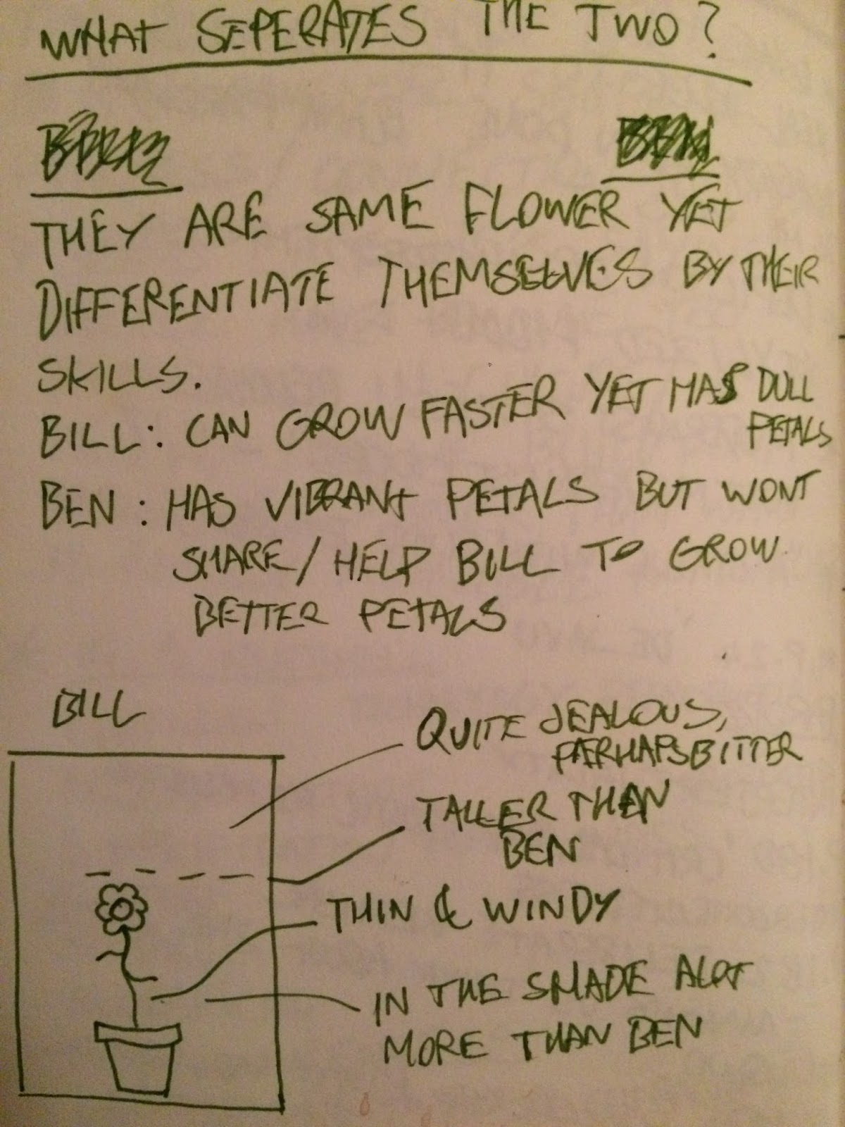


 This week I focused on developing more depth to the characters in my animation by deciding what differences they should have. One character being a passive one with intentions to mediate a situation such as an argument, and the other being the opposite with an argumentative and challenging nature towards the other character.
 I am posed with the problem of how to represent this visually in terms of the way the characters move and their overall look, I shall produce a series of sketches for each of the characters (perhaps 5 with some substantial detail and annotations detailing why I have made certain decisions.
The characters (Ben and Bill) are flowers, Bill is the character who challenges and seeks to evoke an emotional response from Bill, who brushes off his verbal attacks with ease. I would like the character of Ben to be one of someone who is composed and thinks about what they say before they say it, contrasting with the character of Bill who will be someone who acts in child like way - motivated by jealousy and this will be presented through the dialogue that the two characters engage in.
By developing the depth in my two characters' personalities, it has been easier to construct a narrative due to the fact that I am able to plan their actions in accordance with what is happening in their world - in this case a garden wall with a view out onto fields behind them. As the sun rises the plants/flowers awake and turn their attention toward the sun, the objective for Bill in this narrative is to try and outgrow Ben who, we can tell by his physical qualities, is a more well established plant with more foliage.
As the day turns to evening, Bill's confidence in his ability to outgrow Ben is diminished and due to his unfortunate placement on the garden wall, Bill is now in a shadow cast by the garden shed. We then see a change in Ben's character as he gloats and poses reasons as to why Bill is in the shadow, goading him into confrontation.
The plan for the week ahead will be to:
- Produce a finished script
- Have all assets/props completed, scanned and edited where needed
- Produce character's body designs
- Have a finished storyboard with added annotations for dialogue and any audio.
Here is an aproximation of how the first scene may look..

Friday, 21 October 2016
Production Diary - Week Two - Asset Production

I have opted for bright acrylic paint for the objects within my animation to give texture and the aesthetic of a production made for young audiences e.g bright colours etc.
This is because I want to juxtapose this with some adult themes within the narrative of the animation, perhaps in the way that the characters behave - with the discourse between them being something that you would not hear on a children's television program.
When I first canned in each asset the colours seemed very dull and so i had to adjust them in photoshop to bring out the textures a little more.
Overall I have realised I need to speed up my working practice in the next week, this will help me to formulate a clear narrative and outcome of the story.

Monday, 17 October 2016
Production Diary - Week one - idea generation

However I did take inspiration from the channel 4 sitcom 'Peep show' for an idea on the theme 'rivals'. The idea revolved around having the main character going to work and having to put up with an annoying co worker in an office setting, one that he had to compete with to win the affection of his crush.
I felt that this was a good idea for the theme of 'rivals', but could not think of any real practical way of animating the story that would fit involve a mixed media approach which is how I would like to go about producing this animation.

This may result in a very comical looking end result which i am okay with - as long as it can be tied in with the overall aesthetic of the finished animation.

I decided to simplify my idea's - still focusing on the theme of rivals, I looked at the word 'rivals' and thought of other words that could be associated along with it, 'competition' was the first word that came to mind.
I had the idea of two flowers on a wall arguing over who can grow the fastest, or attract the most bees etc. I then realized that i had the opportunity to make something that could be quite playful in the sense that I could include a level of maturity in its delivery but at the same time have an aesthetic that would be similar to some children's television programs.
This is due to the bright colours and acrylic paint that i will be using to create each asset of my animation.
Here is a rough storyboard/thumbnails of what might occur in the animation.
It is still in the developmental stage and will need to develop organically as the project progresses, this is due to the fact that I will be using live action video for the character's faces and want to give the dialogue a slightly improvised feel to it.
I will however use a simple formula to tell a simple narrative of rivalry - the character's may even put aside they're differences to help one another.
Upon reflection I feel that the idea that i am going to stick with will have its challenges in the technical aspect of the project but with some experimentation I will be able to overcome those challenges.

Friday, 7 October 2016
Character and Narrative - potential & limitations - Research: Technique

Technique: mixed media composite
the advantage of having a mixed media approach to animation is that when you are faced with a creative problem - such as when a movement may be too time consuming to animate through traditional means you can substitute the movement for something simpler such as digital key framing, this may however affect the overall style/look of the animation - but depending on the source imagery and its physical properties , one might be able to achieve the same results that were originally intended.
Without straying too far away from the topic of technique it is important to recognize that different techniques can have altogether different outcomes in terms of the aesthetic of the animation, as well as the possibilities of certain techniques to mimic the properties of others.
For example a technique whereby you would traditionally render the line work of an animation and add colour digitally would result in the animation looking asif it had been rendered entirely digitally, as opposed to inking each frame by hand - resulting in a more honest/humble looking outcome in my opinion.
It could be said that because most animation that we see being used for entertainment is produced - by and large- digitally, we as consumers are more likely to say that digital animation has a more professional look. But this is not to say that traditional techniques cannot look 'professional'. An example of this could be the way Noel Fielding has curated his paintings and artwork into the animations used in his show 'luxury comedy'. it is the combination of painted backgrounds and the technique of rendering painted backgrounds into digital animations that i would like to draw my inspiration from for this brief.
Thursday, 5 May 2016
Applied Animation - National Geographic - Final Resolution
Here is the finished resolution to the National Geographic brief. Overall i am pleased with the result but I feel that there are things that i would have changed about my approach to this animation. I opted for a motion graphics aesthetic, which i think it does follow but i can't help feeling that it is lacking depth, it feels too 'flat'. I am happy with the soundscape that I created using clips from the apollo shuttle launch, there is also a bass tone in there gets gradually louder and simmers down towards the end where the National Geographic logo appears, this adds an element of anticipation o the animation.
Applied Animation - E4 Ident - Summary
For this animation to be effective and to take inspiration form the likes of animator Cyriak, I knew that this animation would have to be experimental in way that there should not really be concrete plan for the narrative of the animation - except only a rough destination that the animation/creative process should head toward.
This is the reason why there are no storyboards for this particular animation, as the animation does not really follow a narrative, it is really more about the visual patterns that are being created on screen by the different moving components. I feel more at ease working in this way, although I do realise that this process would probably not be suitable when working with a corporate client that need to see proposals before hand.
This is the reason why there are no storyboards for this particular animation, as the animation does not really follow a narrative, it is really more about the visual patterns that are being created on screen by the different moving components. I feel more at ease working in this way, although I do realise that this process would probably not be suitable when working with a corporate client that need to see proposals before hand.
Applied Animation - E4 Ident - Final Resolution
Here is the final animation for the E4 ident, I have added in a sound bed of which i created myself using various samples including the voice of the character Frank Gallagher. Added to these short sound clips are effects such as echo to emulate a psychedelic sounding soundscape that is not too imposing yet is interesting - humorous - to listen to, something which seems to be a running theme in the other E4 idents.
Applied Animation - Maya Tasks Updated


Applied Animation - Maya Tasks - Walk cycle
In this exercise we had to put in the key poses of a walk cycle and and animate the 3D character called Moom. To do this I used a reference image imposed onto a flat plane by assigning a new material to that plane called a lambert, in the attribute settings I was able to add a file to the colour attribute and this file was the image of a walk cycle - side on. This reference imagery helped me to move the limbs of the character into each pose and I was then able to key frame in these movements.
I found this task to be very fiddly and the way the character moves - although I am happy that it moves - to be very unpredictable, as the character appears to be leaning to one side at the shoulder and I do not know how that has occurred.
Wednesday, 4 May 2016
Applied Animation - Maya Tasks


I also added a dirt texture on a flat plane beneath the truck to give it some setting.
Tuesday, 3 May 2016
Applied animation - E4 ident - Further Process

to give the animation a feeling of fluidity I made sure to key in the center point to emerge on the screen as the other animations did so too.
I have decided that using only the two movements that I have created would be more effective as I could apply them in different ways and not over complicate the animation with too many different movements going on at once.
I have realised that by using the same animation but in different ways is in keeping with this pattern of duplication that runs through this animation.


Applied Animation - E4 Ident - Process

Here is another one of the movements that I will be including in my animation, frank's arms will appear to duplicate from one point as if he were some mancunian demi-god.

To get this affect I had to duplicate each arm that I had disassembled from the rest of the body, roughly 20 times. I then key framed each one of those arms to rotate on an anchor point which i had place on the elbow of the arm so as to appear as if this was a somewhat natural movement around the joint. Not only did I key frame a rotation in each arm so that the arms look like they were multiplying/trailing I also key framed in an opacity drop so that each arm after every movement would fade much like the leading arm was moving very fast and there was a time dilation of sorts.
I think creating this movement has led me to think of a psychedelic approach to this animation with things rotating and growing from a point like that of moving mandala. It was at this point that I knew that the sound track of the animation would also have to take a very psychedelic approach by perhaps combining psychedelic music and some vocal samples of the character that we see on screen - perhaps a memorable quote from one of the series or a catchphrase.
Applied Animation - National Geographic - Storyboard

In the fourth image is the rocket taking flight and in this scene I would add a sound of a rocket taking off, perhaps a sample of an actual shuttle taking off.
In the last scene I imagined the rocket flying past he national geographic logo, in this instance I have not used the logo - purely to save time.
Monday, 2 May 2016
Applied Animation - National Geographic - Research
https://www.youtube.com/watch?v=Cu07lVDiq_Q
The existing National Geographic idents seem to have a scientific orientation around them, using perception, color (yellow), and certain props such as a chemistry set to convey the atmosphere of the channel.
The existing National Geographic idents seem to have a scientific orientation around them, using perception, color (yellow), and certain props such as a chemistry set to convey the atmosphere of the channel.
Saturday, 30 April 2016
Applied Animation - E4 Ident - Movement
I have decided to create individual movements using frank gallaghers image and I want to incorporate them into a much more complex pattern using duplication and key framing movements, opacity, scale etc.
Here is one of the movements I have created using an image of Frank, I have had to disassemble his arms from his torso and key frame them along with the movement of the rest of his body, this gives the animation a more fluid look. I have multiplied the amount of Frank's that pop up and move across the screen as I want to duplicate this sequence so that there are Frank's moving around the edge of the screen in an anti clockwise manner.
Here is one of the movements I have created using an image of Frank, I have had to disassemble his arms from his torso and key frame them along with the movement of the rest of his body, this gives the animation a more fluid look. I have multiplied the amount of Frank's that pop up and move across the screen as I want to duplicate this sequence so that there are Frank's moving around the edge of the screen in an anti clockwise manner.
Applied Animation - E4 Ident - Content
I have researched into the shows that the channel E4 have broadcast and came across the show Shameless, one of the main characters stuck out for me as something i could use for my animation. I have picked out Frank Gallagher as an image that i could manipulate and create complex patterns with for my animation.


Friday, 29 April 2016
Applied Animation - Research - E4 - Cyriak

Cyriak is an animator who has produced an Esting for E4 with a very distinct style, his approach is very surreal with inanimate objects growing limbs and different body parts. The Esting makes use of the logo by having some form of metallic creature regurgitate a numerous amount of 3D E4 logos.
Cyriak's approach to animation works well to voice the channel and its content as E4 is a mixture of a lot of different genres of entertainment.
I feel that I could draw some useful inspiration from Cyriak's work in terms of producing something that is visually interesting yet does not follow a set narrative - this is something that seems to be a running theme in the other Estings that I have Researched into.
Tuesday, 26 April 2016
Applied Animation - National Geographic - Finished animation
Here is the finished animation which I am yet to create a soundscape to.
Applied Animation - National Geographic - Rocket In Flight & Logo
In this sequence I used the same rocket from the previous section and the same background. In this sequence I imported PSD files of clouds that I rendered using the eclipse tool, i then merged these layers to form one solid shape which i then imported in to after affects, i repeated the process for all of the clouds in this sequence.
In this sequence getting the timing right in the animation was very challenging as wanted the camera to track the rocket but also stop at the point at which the rocket surpassed the clouds so that there would be space for the national geographic logo to appear. However I worked out that in order to do that all I would have to do is have the clouds and the rocket traveling out of shot at different speeds, and i did this by changing the distance between each position key frame.
Applied Animation - National Geographic - Take off Sequence
This is the take off sequence that i have developed in after affects, I used shape layers to produce each component in the scene, I added drop shadow to every component in scene other that the background and the windows on the building. This gave the scene more depth without detracting away from the motion graphic stylisation.
The rocket in the scene differs from how I originally was going to design it, with this design I think it is more simple and in keeping with motion graphic stylisation.
I also added a small flame to the bottom of the rocket which I made grow and shrink with a flutter using key framing, adjusting the position and scale of a crimson eclipse.
Applied Animation - National Geographic - Animation So Far
Here is what the animation looks like so far with added sequence of found footage. In the sequence of found footage that I have assembled I have applied a film dissolve in after affects so that each individual clip bleeds into the other. I also applied the same dissolve transition on to the animation section so that there appears a nice blend of colours and tracing of the image as the computer composition moves on to the button sequence.
Applied Animation - National Geographic - Found Footage

https://www.youtube.com/watch?v=06drBN8nlWg
I have decided to add further interest to my animation to include some found footage that would be relative to the 'blast off' theme that i am aiming for. I shall pick out certain segments of the footage that are appropriate to use in this project and cut them down into a short segment of film, I plan to have them at the start of the animation so that the actual animation and the footage can bleed into each other so as the style of the ident does not change very suddenly - it needs to be a smooth transition.
Subscribe to:
Comments (Atom)