Wednesday, 16 March 2016

Evaluation & Reflection - Visual Language

In this module I have produced a lot of visual work yet I feel that I could have done more if i'd have thought more about different ways of approaching each task. 

I have learnt that I need to brush up on my observational drawing skills and drawing skills in general, I also need to make a habit of doodling more, as I feel when your constantly creating things there is a steady flow of creativity and ideas present themselves to your more clearly and with ease.

I also think that the life drawing exercises have taught me that, I need to practice/focus more on proportion and the structure of the body, how it moves etc. This will help me further apply the principles of animation when dealing with a character. 

Something interesting that I have stumbled upon whilst woking on the 'Environmental Storytelling' task is that different visual approaches in the line, tone, texture and colour  of an image can change how we read an image from version to the next. This is something that I am willing to look into further in my studies and experimentation.

Life Drawing Practice - Form Flow and Force - Visual Language


Here the series of life drawing exercises that were carried out as part of this module. The first study is a five minute pose whereby i used charcoal to quickly pick out key features in the subject. I think the use of charcoal is a fast working medium, as in to have a clear image using charcoal you have to work quickly with your strokes as the image can get messy if it is worked into too much.
I didn't really find this exercise challenging but it is good practice to concentrate on a subject and how clothes may fall on that subject.


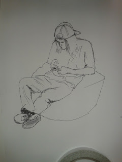
Here on the right is a twenty minute study done in fine liner pen, i found this a little more challenging as i had to be more considered in judging the angles that the limbs were pointing in and in what way the posture of the subject was being carried. He was slouched over looking at his phone, sat on a bean bag and i think i managed to capture this well.


Here  on left is another 20 min study. I found this study harder than the one talked about previously, as i was drawing from a viewpoint that was not familiar to me, this suggests to me that i need top practice drawing from angles that i may find strange/ unfamiliar.
Because of my unfamiliarity with the angle I don't think i got the proportions of the subject right, for example the head appears to large when compared to the rest of the body.


In the drawing on the right was an exercise whereby I was studying how someone might look when they are exerting a certain amount of force on an object.
This force was a pulling force, and i think i managed to capture the pose well in this drawing, this i think is mainly to do with the suggestive lines in the object being pulled and the subject moving away from my viewpoint.

This series of drawings was drawn from a subject striking a series of varied poses exhibiting squash and stretch. These poses were held for 10 seconds each so the drawings had to be simple and just capture the essence of each pose.
I found this exercise challenging but fun, and after a few series of these exercise you start to recognise the quickest way to capture a certain pose which is to me good practice.

In this series of drawings i captured a subject moving through a space, the subject here is seen doing a roll.
I chose to render these drawings in a thick red marker so that the drawings would not smudge like charcoal would have and so that each drawing/ each key point in the movement would stand out.

Richard Williams - Prologue - Form Flow and Force

'Prologue' , an animation by Richard Williams relies heavily on the human form, the animation holds so much detail that the production is almost photorealism. I expect that Williams took careful consideration  in drawing the muscles in the face of the characters seen on screen.
It is hard to comment much on this short film, due to the fact that i cannot find the whole film just the trailer, but I can see that this film has taken an immense amount of effort to produce, with a lot of influence coming in from life drawing.

Tuesday, 15 March 2016

Sequential Imagery - Research - Set Series Sequence

 For my research on sequential imagery I have chosen to look at comic books, this particular comic book is from a series called 'Zero' and i have chosen to analyse it for its clever use of panels within the comic book.
The panels within this comic book are very cinematic in that there are lots of different shots similar to that of a film, I think this more common with modern comic books as comics such as spiderman, superman etc had a lot of dialogue talking your through what was happening within a scene, rather than there being more visual storytelling aids.
What I like about this sequential imagery is that the artists have not only managed to capture each movement from one to the next but also the change of atmosphere using colour.
With sequential imagery there is a science behind where you should lead the reader/viewer's eyes. It is much easier for the reader/viewer's eye - in the western world - to follow the story from left to right and this adds to the fluidity of the story as a whole.

Ideas for Storyboard - Visual Language


Here were some rough thumbnails for the storyboard that depicts the story between these two characters, a bus driver and a passenger waiting for the bus.

Set, Series, Sequence - Visual Language - Storyboard


Here I my storyboard that features the focal point of the series of images that I have produced around the word 'Bus'. It tells the story of a bus driver and a bus driver, it subversively describes the monotony of public transport, the way both passenger and driver start the day relatively fresh but then both end up run down and tired - this could perhaps be a comment on a wider note of long hours and little pay.

Form, Flow and Force - Life Drawing For Animation - Disney

Life drawing in Animation is crucial to an animator understanding the bone structure and muscle composition of the subjects he is trying to animate, this helps the animator to understand how a subject will move and to better apply the principles of animation to the subject.
For example disney have held life drawing classes using clothed & unclothed models for over 80 years for their artists to be well trained n recognising the human form and how material falls on the human figure.
Life drawing is not only of humans but also of animals and this practice of drawing from life has been used for example in films such as lion king and jungle book to help the animators gain a better understanding of how each animal might move.

Joanna Quinn - 'Girls Night Out' - Form Flow and Force

Animator Joanna Quinn focuses a lot on life drawing and this comes through in her animation ' girls night out '. Although the animation exaggerates a lot of the movement in the characters the mass and weight of the character remains the same/stays in proportion. In her animation 'Britannia' it is even more evident that she has a very good understanding of how limbs move around the joint due to her experience in drawing life.


Monday, 14 March 2016

Environmental storytelling - Casino - Development


Here is a digital development on the drawing below that was the original composition I have decided to render the image again in a similar manner to the previous image of the set.
I opted to go for a silhouette look to the image with the neon pink highlighting ridges on the building as neon lighting.
I think that the taller part of the building being positioned in the top left of the image assures that the building is the focal point of the image.

Environmental Storytelling - Sketchbook - ideas and development


On the left is a sketch of the casino form a high-rise building across from the building.


On the right is a set of thumbnail sketches documenting possible approaches for the images mainly of the casino. I also thought carefully about the framing of these images.


Here are some primary sketches to one set of the images I have produced. I made sure to include notes on the state of the building so that i might be able to replicate that in my drawings.

Environmental Storytelling - Spongebob Squarepants Analysis

In this series a lot of the environments could easily be interchangeable, but what i have noticed by looking at and paying close attention to the backgrounds is they are of a consistent style.
This helps as in any series to build a world around the characters with in it that could perhaps have its own set of rules/laws of physics to make it have a strong concept.
From there mythologies can develop and the rules that govern that world can be compared and played upon for comedic effect, for example the idea of having a beach under water - Blue Lagoon, I feel ideas like this really start to give the audience a mental map of the environment or how they imagine that environment to be.
The backgrounds that build up the environment are hand painted and are bound to a Hawaiian style of floral patterns and  bright colours, in some shots there is an effect that is overlaid over the environment that appears as what looks like light passing through waves, the sort you would find at the bottom of a paddling pool in the sun. It is little touches like these that add depth to the environment.


Sunday, 13 March 2016

Visual Language - Captain character - You Spin Me Right Round


Here is the turnaround for a character I have created called Phil.
I have decided to render the turnaround in black and white, with only line work showing to give people a basic understanding of his appearance and the the effect that gravity would have on his body.

Environmental Storytelling - Casino - Setting & experimentation 2


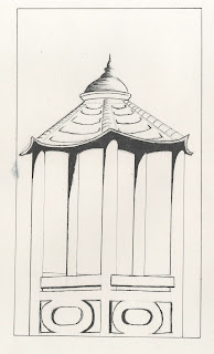
Here is a pegoda that i decided to draw that was in the area of the casino and again i have tried to carry through the colour scheme into this image also.

Environmental Storytelling - WALL-E Analysis

WALL-E is a film that relies alot on its element of environmental storytelling, with wide screen landscape shots that sweep the viewer through the post-apocalyptic landscape and describe how it came to be this way with close ups of mementos of the world since passed. There is a real varied mix of shots to try and capture every aspect of the desolate environment.

The story of a polluted environment due to mankind is told well in WALL-E through its use of colour I feel. The sky is hazy and filled with clouds of dust, everything in the environment appears to be the same shade of beige - to brown. Signs are rusted and tinged with the same beige-brwn colour.

However when the story develops we see a very clear contrast between that world and the environment on board the spacecraft that is home to the survivors of mankind that have been evacuated from earth. We see that on the ship, everything is clean and automated, with blue and red neon colours streaking through the white/grey interior of the spacecraft.

I think what this tells the viewer is that through technology we may progress, but at what cost? In the environment on earth in WALLE it is clear that all of the pollution came as a result of overproduction of consumer products and the resulting wastage from said products.
There is a good environmental message in this film that can be applied to the current times more so now than at any other point in time


Environmental Storytelling - Casino - Setting & Experimentation


I have decided to document the setting the casino sits within aswell as the casino itself to provide a better insight to what the atmosphere is that you feel from this place.
Im struggling to get across the run-down aspect of this location, I think this is down to the nature of the media i have chosen use and the way I have taken a considered approach to the application of the media.

I am following on the colour scheme that I experimented with previously throughout these series of images to produce a cohesive story of what the atmosphere of the location is.

Friday, 11 March 2016

Visual Language - Set, Series, Sequence - Series 03

In this series I wanted to illustrate the monotony that the bus driver must go through in his day-to-day. The first image I concentrated more on the line of the image and how the line work with little tone could illustrate the depth of the image.
In the second image I decided to work with more tonal qualities, using a mixture of charcoal and oil pastels. I used the orange pastel colour to represent the amber light emanating from streetlights, showing that the bus driver works night shifts also adding to the misery of his monotonous job.

Visual Language - Set, Series, Sequence - Series 02

In this series of images I have decided to better show the transition of the bus driver into this rundown zombie-like character. I have done this by thinking cinematically about my composition and cropped the eyes of the bus driver into a 'letterbox', I did this as the eyes are the most telling feature in a person who is rundown, tired.

Visual Language - Set, Series, Sequence - Series 01


For the series of images i decided to elaborate on the image of the 'zombie bus driver', investigating how i could get this image across using different media and different approaches to composition compared to the original image.
I began with at first with simple continuous line drawing in a cropped rectangle, I felt that the image had a somewhat graphic design look to it. I then took this basic formula of the composition and experimented with felt tip pens and oil pastels in replicating the image to achieve a series of interesting results.
In one of the images/series of images, i decided to show the transition of the bus driver becoming a zombie, again sticking with the same formula of composition.

Visual Language - Set, Series, Sequence (OUAN404)

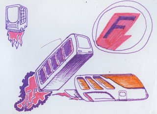
In these images I was experimenting with the characterization of buses and things associated with buses such as a bus stop. For some reason, perhaps down to my experience of public transport, i imagine very dull settings or a mood that is miserable surrounding public transport.

I imagined that if a bus were to have a personality it would be that of an obese business person, in a rush - but unable to move fast due to its size - large, angry and inconsiderate.

In contrast to that we have the image of a bus stop and when I characterize it, I imagine it to be miserable, lonely even. in the image I created I decided to add a washed out grey atmosphere to it to reflect the sombre emotions that I imagine being attached to a bus stop.


Visual Language - Set, Series, Sequence - (OUAN404)

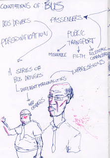
These images represent the characters that we experience on the bus, the drivers, passengers and my own experience of coming into contact with these people.
I have envisaged the bus driver as a sort of zombie-like character as a visual analogy of the monotomy of the job, I based this image on a sketch of a bus driver that looked extremely miserable, tired and over-worked, there are some subtle references to the job also in the colour pallette that I have used and symbolism through re-appropriation of logo's and text associated with public transport, such as the text on a bus ticket.
Sometimes bus drivers can be rude and almost undeserving of ones respect and so an image that i have conjured up to represent that is a roughly drawn stereotype that I hold in my mind, of a bus driver rudely asking for a bus pass. The stereotype that I hold of a bus driver is an over weight, aloof spectacled man, moulded that way due to the monotomy of his job.
one of the images that i created whilst cotemplating my own experience of catching the bus, was an image of 2 characters laughing very loudly behind a character that looks irritated. the irritated character represents my own experience as I find it very annoying when there are people behind me laughing louder than what seems acceptable.
The colour that I have used in this image along with the composition is meant to represent the stress building up whilst on that given bus journey.
Another of the images I have produced represents some of the characters that may get on the bus.
The characters I drew were of an old lady and a mysterious detective character wearing a long trench coat - used to represent some of the eccentric people that sometimes catch the bus.


Visual Language - Set Series Sequence - (OUAN404)

These images fall under the classification of being my own interpretation of the word 'Bus' and all of the fassets that surround a bus, riding a bus, waiting for a bus, watching the scenery fly past etc.


These are however only a select few images that are of my own general interpretation of the word 'Bus'.

Monday, 7 March 2016

Environmental storytelling - Research/Analysis - AKIRA Katsuhiro Otomo


 In the feature length animation 'AKIRA' written and directed by Katsuhro Otomo I found the
 environments to be very detailed much like the illustrated comic book version of the story.
The story is set after WW3 after a nuclear explosion destroyed Tokyo, 'Neo-Tokyo' is the post nuclear advanced futuristic setting that this story now plays out in.
Most of the story surrounding the setting of the city is told through its lighting and great sense of scale and detail that Otomo brings across in his original comic book version of the title.


In work that features a lot of detail I feel that it is the composition that makes somebody focus in on a certain aspect of an environment, this is certainly true for this piece of animation.

It is the transition from different settings and the variety of different settings in this animation that really begins to reveal to the audience the scale of the futuristic city that this story plays out in.
By analysing this animation, and comparing & contrasting it with an animated series like 'The simpsons', I find that the detail in the environment that the story is taking place in can affect the believe-ability of the animation dramatically. 'The simpsons' series does have some degree of believe-ablity to it but its a belief that is only relative to the characters in the story/animation. Whereas with 'AKIRA' the believe-ability stems from something that is more relative to our own reality, in the real world.


Environmental Storytelling - Casino - Experimentation/idea generation


This image is a digitally altered photograph of the casino, I felt that I needed to explore different medias and new ways of looking at my chosen location. I decided to add a neon pink backdrop to the casino to give of the impression that the casino is set in a place like Miami for example.


When we look at programs such as ' Miami Vice' for example, we see this pink neon through to light blue colour scheme in the title sequence and this is also replicated/played upon in the game 'Grand Theft Auto: Vice City', especially in the loading screens.
I think using this colour scheme in my work for this location would work well to tell a story of 'sleazyness' through juxtaposition of an aesthetic that could perhaps suggest exoticism and affluence and a the look of a location that is trying too hard to be just that.

Thursday, 3 March 2016

Visual Language - Set, Series, Sequence - 24 images - Grouped By Colour

In these images  I carefully considered the colour that I applied to them. I wanted to use the same palette of colours that one would usually associate with buses/public transport. For example pink purple white & red. however in these images there are different themes, these themes will be elaborated on in further posts. it is only the use of colour, I feel that ties together these particular images.


Visual Language - Set, Series, Sequence - initial idea generation


Here are my initial mind maps and idea generation proccesses, I was trying to think what what would be the best way to explore this task either through observational drawing and collecting photographs and research via the internet of different types of buses or would it be best to draw images that are relative to buses but not a literal translation of the task, more of images that represent references to my own experiences on buses. For example stereotypes that we may find on buses, the mess that can accumulate on public transport, the vandalism, the characters we find on public transport, the colour pallette etc.

Applied Animation - Idea Development 01 - E4 Ident - Background ideas

I have decided that I want to get 'hands on' with my animation for the E4 ident. this has come about through creating a background from found materials that happen to have similar colours to what have already been used in E4 indents.
With this step in my development comes new ideas for how the ident will play out, I want the animation to have a cut-out look to it. 

Environmental Storytelling - Abandoned Offices - Image Production & Reproduction

For this location I wanted to experiment with choosing one viewpoint of the location and put that viewpoint under different conditions of lighting, different media, qualities of line and see how the changes in the aesthetics of the drawings/images changes how we interpret a space.

In the first two drawings I was more concerned about coming up with accurate representations of the building itself and concentrating on my line work than capturing the atmosphere that surrounds the building.

I will do further studies of close ups of the building to show the effect that dis repair and no maintenance has had on the once corporate looking building, such as rust and the grime of the city staining the brickwork.


In this image I wanted to experiment with colour and how colour can represent certain themes. This image to me represents a reflection of a building in a window and the sunset saturating the
urban landscape.

I think also the rule of thirds is at play in this image with the CCTV camera being close to the bottom left hand corner and the use of negative space in the top left of the image, this composition puts emphasis on the subject matter that is the building.

I have also decided to crop the image with cinematic like borders at the bottom and top of the image.


In this image I decided to use a combination of watercolour and fine liner.
I have realised that I need to practice my perspective drawing and studying the work of others and how they have used perspective in their work in a way that appeals to me - which will inspire and motivate me to improve my drawing practice.
The use of watercolour I felt would have been more effective if i'd have used more control and be more considered about the application of colour.

Tuesday, 1 March 2016

Environmental Storytelling - Casino - Image 1


In this image i decided to take inspiration from the hazy sun-drenched look that 'Breaking Bad' achieves in its cinematography to accentuate the context of the buildings setting.
I also decided to add a film like border to crop the image.
I think further images of this series i will include greater detail to capture the rough edges of the environment and would in general add more depth to the image.