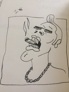
As it stands this is the final resolution to the brief, not completely refined yet but finished. I worked on the audio score to the animation using recordings of conversations I had with people from the pub - people who worked there and punters in general.
Wednesday, 17 May 2017
Final Resolution
As it stands this is the final resolution to the brief, not completely refined yet but finished. I worked on the audio score to the animation using recordings of conversations I had with people from the pub - people who worked there and punters in general.
Tuesday, 16 May 2017
Weekly diary - Applied Animation - week 6 through to 9
This period of time was spent rotoscoping the frames for our animation. This was painstaking work yet rewarding seeing the finished outcome.
We split the total amount of frames 50/50 roughly amounting to 200/300 frames each.
The idea of representing ourselves on screen with respective art styles has had to be put to rest due to time constraints. And due to said time constraints it has been decided that the documentary will have more of a poetic aproach to the final resolve - something that encapsulates that environment of the pub - the place where our research into stereotypes has lead us.

Thursday, 27 April 2017
RESPONSIVE EVALUATION
Overall I think this module for me has been
successful and I have produced a lot of work for competition and live briefs.
My time management and being able to juggle multiple briefs and
responsibilities at once has been good, and I think that for this reason the
work that I have produced hasn’t suffered too much in terms of the quality – as
the quality of the work across all the briefs has been consistent. The same
could be said about the collaborative work that has been produced whilst
working through this module, time management and work ethic has been consistent
throughout.
Despite the quality of the work being consistent throughout the whole of this module I think that the work could have been a little better – there are some areas where I think that I could have done better if I pushed myself a little harder to gain a little more refinement to the finished article.
If I were to revisit this module I would have taken more time researchinhg and seeking out competition briefs that suited my own creative interests a lot more than the ones I have chosen – although this does depend on there being competition briefs that run whilst this module is set. And this is not to say that most of the briefs that I had chosen to produce work for didn’t hold any opportunity to pursue my own creative interests, it is just that at some points within this module I felt like I was producing work that I did not have any meaningful interest in or felt like I was gaining something by doing it – however this may have served well as experience of what it is like work within the creative industry, producing work to ‘keep the lights on’
The things that I feel I enjoyed the most about this module was the wide choice of work that you could produce. It allowed me to produce work that was not necessarily relative to animation but more illustrative, and as I regard myself very much as a generalist in terms of my creative practice I found this quite enriching.
What I also enjoyed was the chance to experiment with different mediums in the more open briefs that were more relative to my specialist subject of animation, most notably the work that I produced for the ‘do it in twenty’ brief. This has helped me open up to new possibilities and new ideas – new ways in which I can approach future briefs.
I think what I least enjoyed about this module was having to pick briefs that I felt I had little or no interest in just to fill criteria, I initially found it very difficult to pick briefs and start them due to not being able to find any that I felt I would produce really good work for, due to them being interesting.
One thing that I think I need to improve within myself is my ability to work with others and challenge them abit more in terms of the intial ideas that we come up with, however this comes from me looking at the work we produced collaboratively and thinking it could have been better – but there was only a very short window for the pre production phase of the larger project that we worked on.
I think whilst working on this module my time management skills improved quite considerably, having such a varied and large amount of work forced me to be more organised and clear about what I was doing with my time and why I was doing it, this enabled me to concentrate on producing the work and order things in terms of priority.
This module has also given me a good insight into what it might be like work in the creative industry as a general creative practitioner working for yourself and collaborating with others, producing work because you have to for one reason or another seems like the biggest lesson/ message that I detract from working on this module and I understand that this will not always be the case but it is a realistic reminder of what working in the creative industry might mean for people at certain times in their career.
Thursday, 20 April 2017
Responsive Individual Practice - Do it in Twenty - Utopia
Here is the finished resolution to the do it in twenty animation competition brief, I am very pleased with how this turned out due to the amount of work that I put into it in a short space of time and rotoscoping each frame by hand in pen and other materials. Through experimenting with this method it has made me want to do more of the same and apply it to other projects.
Collaborative Practice - 'Utopia' 20 Second Animation pt.2


Whilst Eva designed the print that we would eventually scan in and use as the background for our animation, I also helped with screen printing as the design was quite large and it made it easier and alot quicker there being two people participating in the act of screen printing.
Once the screen printing was done we scanned the best prints in and chose the best one to use as a background for this animation.
Once the background was scanned in i was able to composit the characters that I had designed into the animation and make adjustments to the timing of each movement.
Once the animation was complete I added some non intrusive music over the top, which I made myself - just to get over any copyright issues of using somebody else's music.
Sunday, 16 April 2017
Collaborative Practice - 'Utopia' 20 Second Animation pt.1
Me and Eva Gould (Illustration BA hons) have worked collaboratively on this short animation project.
We chose to work on this brief to satisfy both of our creative ambitions/needs as it were, with eva designing the backgrounds for the animation and with me making a focus on character designs. With our roles assigned from the get go without any ideas thrown out or pushed around the table we were able to say ' this is my role within this collaborative project' and be satisfied that there was no confusion over what work would be designated to one another.
Whilst in charge of the character design I also took on the role of lead animator and assembly of all the different components of the project.
So for this project we first looked at the theme that was given on the show-me-the-animation website which was 'Utopia' and decided we would interpret this very literally by coming up with a landscape/environment that would embody this idea of utopia - idyllic scenes with bright colours. We took inspiration for how the scene might progress by looking at the animations ' SAUSAGE ' on Vimeo and the music video for Mr scruff's 'sweet smoke'.
 The inspiration that these animations provided us with gave us the idea for the scene to look really innocent and transition smoothly through any different aspects that we may incorporate into the piece.
I first of all had to wait till Eva had designed the landscape for me to have some kind of bearing on how my approach to character design should complement her work on the landscape (Above).
Above is a preliminary sketch by Eva which I then tried to complement with my character designs.


As my sketches progressed they began to take a more shape based form. which I felt fit with Eva's design better than the line based designs first approached this project with.
this is because i see the landscape having smaller, full bodied characters dotted around it and these larger facial designs emanating from the smaller full bodied characters as a kind of insight into what they may be doing at that time/ show the mood of the people living in the landscape - or 'utopia'.
Responsive - Live Brief - Cassette Tape Cover - Character Based Design pt2


I also drew up some scenery for the characters to be running through and away from the monster with a gradient in the background that would appear as if it were night time and the scene is light up by moonlight.
At this point I am ready to submit the artwork to the pair and talk payment, the pair have seen previews of the work and there are some minor considerations that they may handle themselves as they come to finalizing their mixtape and look at the pricing for the tapes themselves.
Responsive - Live Brief - Cassette Tape Design - Character based Design
For this brief I was approached from outside of university by a music producing duo under the name Meddling Kidz, they had a very clear idea of what they wanted as a design for a J-card insert that would go inside a cassette tape case that they wish to put out as a limited edition mix tape of their original music.
The theme they suggested to me and the reference imagery I was given were certain characters from the 70's cartoon series 'Scooby Doo Where Are You?'. As the title track for the mixtape was to be named 'Wax' the pair wanted to include a character of similar appearance to the classic 'wax phantom' character.


With copyright in mind I did not want to imitate the character line for line but just have hints at him and the artist's work on the television series.
The pair also wanted the a mystery machine-esque vehicle that would have depictions of the two musicians/producers in my own artistic interpretation of some reference imagery that they provided.(below)
I then took this reference imagery and produced some character designs for two. -see in next post.

Collaborative Practice - UK Greetings YCN Brief
 For this brief I collaborated with Eva Gould - BA hons Illustration, The deliverables for this brief were a series of greetings cards, note pads, gift wrapping and gift bags.
The target demographic was adults of all ages and the theme of the deliverables that we decided to do was a cheese and wine orientated project with quaint illustrations that were simple and non intrusive/obnoxious. The reason behind the theme being cheese and wine is the theme had to be an activity that adults enjoy socially - we both thought that the theme that we had chosen worked well as an activity it is more about the social aspect of sitting down to enjoy food with friends etc.
Above are the preliminary sketches of the components that would make up each greetings card, notepad, gift wrap and gift bag. These I did myself.


Eva then drafted up some typography that would accompany the illustrations once they had been rendered further digitally.
The greetings cards were as follows: 'Happy Birthday' 'Thankyou' 'Congratulations' and 'merry christmas'
in addition to adding the typography to the appropriate card designs Eva also added some extra illustrations for the 'Merry Christmas' greetings card, some holly leaves to add to the festivity of that particular greetings card.
This Design board features all of the greetings cards, notepads, gift wrap/gift bag designs that me and Eva collaborated on.
Before Eva put these mock ups together of the actual products it was my job to scan in the preliminary drawings I had produced and render them digitally. I then applied these finished illustrations to the appropriate designs that I had sketched out in my sketchbook before hand. I also followed the same process when putting together the repeating patterns of the giftwrap/gift bag and notepad.
Monday, 20 March 2017
Applied animation - Inspiration/research - Ryan Larkin documentary - 'Ryan'

I found a documentary by Chris Landreth to be really helpful/ inspiring in deciding how our characters might look in the animation, giving me the idea to just use our own art styles to represent ourselves. This is what i think chris landreth has tried to do in his representation of himself and the representation of Ryan Larkin - likening some aspects of his physical appearance to represent similar aspects of his personality that Chris feels has some kind of a relation to with Larkin.
Applied Animation - Animated Documentary - Weekly 5
 |
| Bar maid collecting glasses as punters chat |
We have decided based on the quality of the research we have gathered that we should choose to focus our research/experiment to just pubs. This is because people are more approachable and sociable, more willing to engage in the experiment. And by limiting the research to the pub environment it will make it easier to produce an animation that has a well rounded aesthetic that encapsulates that environment - giving the documentary more bite/ substance to it.
We went to The Fenton, a local pub near university which has in it a consistent set of regulars and would make for a great place to gather further material to feature in the animation.
We decided to visit here to gather reference material and footage to experiment rotoscoping with.
The next step that needs to be taken is to write a rough screen play that we can followed and make gathering footage to rotoscope easy, it will help to also arrange the footage when it comes to editing the the footage into an order that best carries the story through and keeps the interest of the audience.
This week we have also decided to make the first of our reflections on the research that we have gathered. Me and Ollie made use of the sound booth to record ourselves being interviewed (but more so conversationally) by one of our peers. I felt it important that the tone of the interview be quite laid back as if we were in the pub having this conversation about the experiment we are conducting. With the recordings that we have amounted we plan to make some lip syncing experiments using characters that are representatives of ourselves in our own respective art styles.
The idea is that whenever both of our characters are on screen the two art styles representing our faces will contrast and give another layer of how we percieve ourselves - I think that this raises a question for the viewer being something like 'are you your art?'. I also think that when documentaries get people to question themselves or make people just feel the need to ask questions in general it raises the quality of the documentary to a much higher standard.
 |
| Juke box, iconic piece of reference material |
Sunday, 19 March 2017
Applied Animation - Animated Documentary - week 4 production diary
This weeks production consisted of developing ideas on how we might arrange the visual aspects or rather the visual storytelling elements of our animated documentary beginning with rough storyboards and visual aids to present at the presentation/ group crit.
The feedback that we received from the crit was that we have further pre-production and planning that still needs to be done to consolidate the idea behind the project and make it concrete so that we are able to form clear cut production plans.


Applied Animation - Animated Documentary - Weekly Production Diary - Week Three
This week pre-production slowed as other projects have taken greater priority.
I did however take the time to find some interesting secondary research - a photography project by James Mollison called Disciples.
In this project the photographer takes photographs of concert goers outside of the venue and what this amounts to is a series of photographs in which we see the fans of the musicians imitating their idols to such a high degree that everybody looks more or less the same - part of a tribe one might say.


I also found this photography project by CJ Clarke - Magic Party Place which gives an inside look deep into the heart of council estate britain - or at least the lifestyle and culture of the real working class. I found this inspiring as I feel that sometimes when the phrase 'working class' is brought up in conversation there can often be connotations of people being 'benefit spongers' and somehow the people having less dignity or compassion as those better off financially in society, also I feel another connotation that sometimes may come into the fervor is that the white British workling class have certain racial dispositions - this be due to groups like the EDL - English Defence League and Britain First, whose supporters are largely classed as white British.
What I think this project does however is show the tight connections that the people of Basildon have with each other in small groups of friends and families - showing this other compassionate side to what may appear to many people as these people being defensive and close minded - disinterested in life outside of the town but finding comfort in their own homes, streets and pubs.

 I find this project a really valuable source of inspiration in terms of looking at stereotypes as this gives an inside look into the lives of people that may to many people outside of this lifestyle have a negative stereotype attached them. For example the youths with their tops off wearing trackies may to some people look like 'chavs'.
Thursday, 9 March 2017
Responsive - LSR: Transmission - Fundraiser T-shirt Design - pt. 2

I followed up this live brief by going to see my designs being sold at the fundraiser event.


Monday, 6 March 2017
Responsive - Do It In 20 - Utopia
For this project I have been given 2 months to produce an animation following or subverting the theme 'utopia'. The idea for this animation stemmed from one the context of practice lectures focusing on culture and subcultures - mentioning the Brixton riots of the early eighties and the musical movements that were around at the time calling for racial equality.
I have chosen to rotoscope and manipulate frames from archive footage of the Brixton riots, the reason behind this and how this relates to the theme of utopia is from researching the tensions between the black community in Brixton and the police's racially motivated brutality against the community.
I aim to experiment with different mediums for rotoscoping each frame to bring together a variety of textures to the animation.
Here is the first example of rotoscoping that will feature in my 20 second animation, using just fine liner to outline key features in each frame and to add ashading in some areas. I have opted for a very loose style that has allowed me to capture roughly what is happening in the footage but also to help me progress quicker to the post production phase of this project.
Responsive - LSR: Transmission - Fundraiser T-shirt Design - pt. 1
For this live brief I was asked to come up with a design that would emulate the branding that was put forward by the Leeds Student Radio committee.

I was approached by Beefy Squarms - a leeds/london based art collective to collaborate with them on this brief - producing a design that would be sold alongside a few other designs of they're own.
Below is the finalised design that was to used on the T-shirt.


I was approached by Beefy Squarms - a leeds/london based art collective to collaborate with them on this brief - producing a design that would be sold alongside a few other designs of they're own.
Below is the finalised design that was to used on the T-shirt.

Responsive - Skateboard Design Competition 'Decks For Change' - Final & Submission

If I were to change anything about this design it would be to remove the characters behind the yellow and blue ones to give them more space as the composition looks cluttered.
I also feel like the repeating pattern of the characters in the background may have also worked as a standalone design in itself.
The deadline for this submission was the 1st march which I submitted to Decks For Change via Email in the form of a PDF.

Responsive - Skateboard Design Competition 'Decks For Change' - development


 I discovered a competition called 'decks for change' which focuses on using skateboard designs and relative artwork to raise money for skatepark developments and skate schools in developing countries that helps introduce communities to an activity that brings together the youth of both genders in said communities, the sport also encourages people to take risks and achieve things that they might not have thought possible of themselves.
The brief for the competition was quite open, it was based around positivty and notions or ideas that may bring about positive change in the local/global community.
My inspiration for this competition brief came from looking at the way indigenous tribes view mental health from a shamanic perspective, shamanism being something that we in the west have completely lost touch with in our culture.
http://www.wakingtimes.com/2014/08/22/shaman-sees-mental-hospital/
The above article details the views of a shaman/healer from the Dagara people visiting the scenes of a mental health institute. They regard somebody suffering from mental illness as somebody who is recieving a message from the spiritual world that may benefit the rest of the community as a whole.
However due to shamanic practices being almost completely abandoned in western society, the person suffering from any mental illness then lacks the guidance or spiritual tools to come to terms with the 'spiritual crisis'.
I treat this brief as an opportunity to produce abstract character designs that have a very immediate feel to them so as to reflect abstract nature of shamanic practice and of the spiritual realm.
The images in this post are of my development process with in this relatively quick turn around competition brief. I enjoyed producing the work for this brief as it was very non prescriptive and allowed me to experiment with new materials such as thick acrylic paint pens which give a very expressive look to the work being produced aswell as the ability to layer up colours on top of one another as demonstrated in the images above.
Tuesday, 21 February 2017
Applied Animation - Animated documentary - weekly diary - week two
 |
| Quick GIF of a sample of the sketches.. |
This week to gather more primary research (sketches and interaction with the public) we visited various places around leeds with a different setting for each.
The first place we made a visit to was the Henry Moore institute art gallery, here we took sketches from and spoke to the curators of the gallery about the types of people that are most likely to visit the gallery. What we found was that the curators experienced visitors from all walks of life and there wasn't really a specific type of person to visit the gallery. This made me wonder if this view is actually true or if the case is that the curators weren't all that critical in they're analysis of the people that visit the gallery based on the way they look.
Next we visited a series of record shops, the first being jumbo records. What we learned from the shopkeep at jumbo was that he, as somebody who works at a record shop is able to look at a person as they walk into the shop and have a rough idea of what a person might be into in terms of music, this brought about the thought that music has a lot to do with identity and sense of inclusiveness.
What I learnt by speaking to the shopkeeper at Relic records was that he too would easily be able to make assumptions as to what a person may ask for in terms of music based on their appearance, he also said that although the store caters for a wide range of musical interests, what he himself has noticed is that there are a growing number of female customers visiting the record store where once the store would have been frequented more by male customers.
When we visited crash records, it was a very similar story to what the rest of the record shops had told me, and I think that this is a link that I should carry through into my secondary research by looking at subcultures and the music that is associated with them.
Sunday, 12 February 2017
Applied Animation - Animated Documentary - Weekly Production diary - Week One
This week an idea for this animated documentary was formed under the theme of SCIENCE, The idea aims to look at stereotypes and how people perceive oneself under certain circumstances, this could be the environment, personal bias. The practical aspect of the idea involves gathering primary research via going out into the public and gathering portraits from members of the public, whilst simultaneously asking them questions of what they think of our personalities based on just our physical appearance.
From this we aim to use the portraits to produce a morphing animation of each others faces. Once the research has been conducted we shall make an audio commentary on what we discovered about the public's preconceptions about the type of persons we may be just from our appearance - this will then be animated to with a character of our own design.
FIRST CONTACT -
On Thursday of this week I was at a fundraiser event at the Brudenell Social Club of which I had contributed to by selling one of my own designs as a T-shirt. I also had with me my A6 sketchbook and so felt like this would be a good opportunity to begin with some primary research. The demographic was largely made up of students and young people - this was due to the fundraising event being put on by the Leeds Student Radio.
With the atmosphere being relaxed it was easy to find people willing to contribute to the project, when i approached people i first said that the portrait was to be part of an animated documentary and I was unsure whether or not this had any effect on how the people participating perceived us.
What did have an affect on how people perceived us or how they said they perceived us was that i noticed if the person who was getting there portrait drawn was stood further away and could not see the reaction until later - the participants were more honest about their preconceptions of the person they were drawing. This may be a problem that we have to overcome by different 'interview' tactics, e.g asking the participant to draw one of us from a far whilst they think they are not looking.
Overall I think that this first taste of primary research has left me feeling positive about future work on this project, I may also try to bring my sketch book and a pen with me to places that are busy yet have a slightly different demographic.
Friday, 3 February 2017
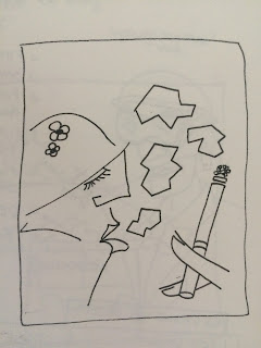
Responsive - Roald Dahl - George's Marvellous Medicine 2


I am pleased with this illustration, I feel that there is movement suggested within it - perhaps due to George being clumsy and knocking the bottles and jars around on the shelf.
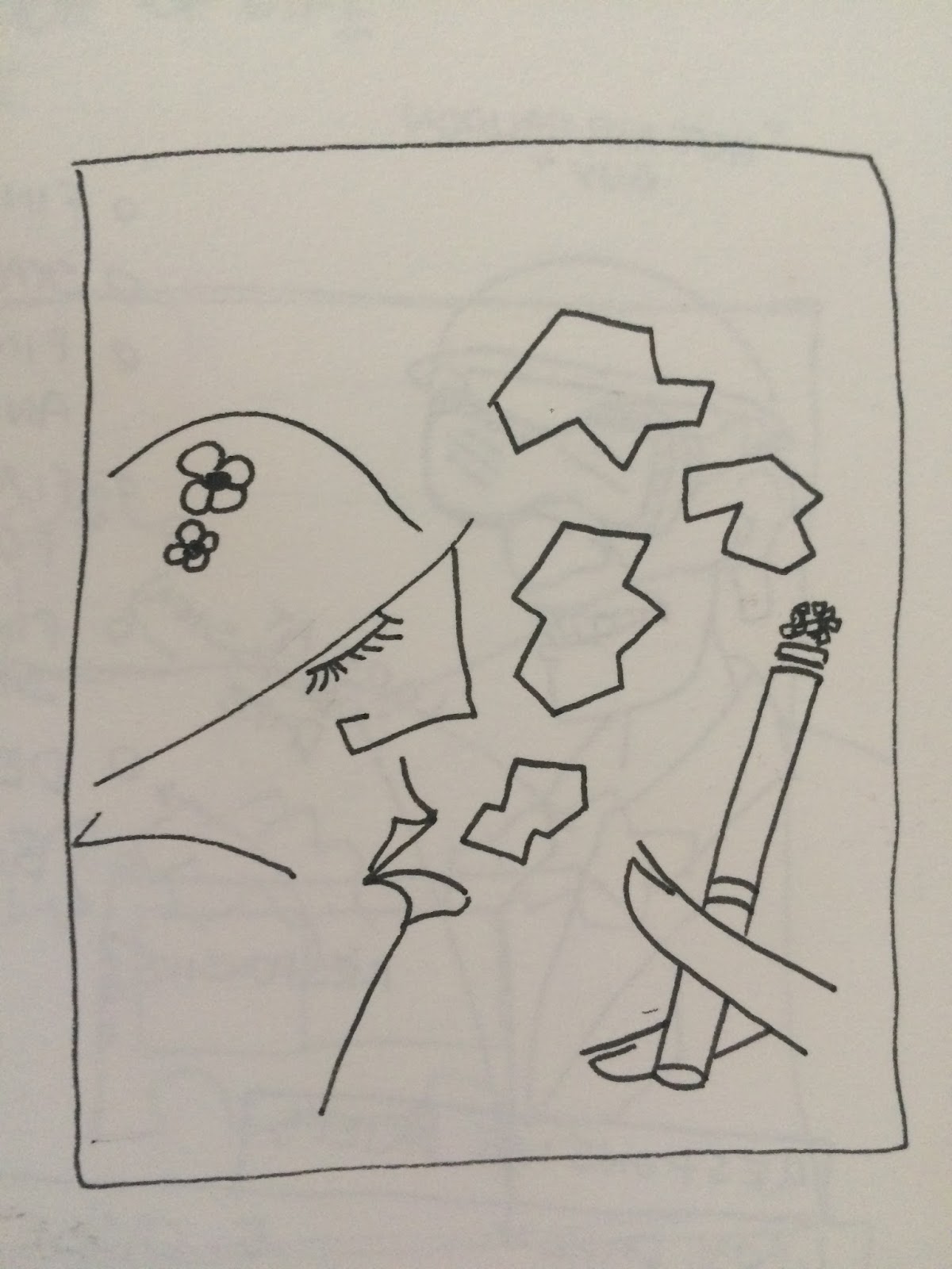
Responsive - Roald Dahl - George's Marvellous Medicine 1

The way I thought I thought i would do this would be to include lots of ingredient bottles and show George reaching for them and mixing them together.
The only creative problem that I ran into whilst trying to think of composition that would do this was thinking how to arrange each element.

Here below I was contemplating and practicing what the shape of George's Head should be.
Subscribe to:
Comments (Atom)