Wednesday, 25 November 2015

Animation: Processes and Production - Further Development (OUAN405)


Here I was demonstrating visually how I might show the transition to night time in my animation. After having feedback from a critique i have been presented with suggestions from my peers as to how I could illustrate the transition from day to night.
I could save time in production of the animation by instead of using blue ink on the frames, alter the hue and saturation of the image in the post production phase.


Here I was considering the characters body language and how it could change with the transition from daytime to night time and suggest how the character was feeling.


Here I was practicing my drawing skills in anticipation of the characters movements within the animation, I feel it is good to draw the character in a range of different positions even if the positions that the character is drawn in do not feature in the final piece of animation.

Monday, 23 November 2015

Animation: Processes and Production - Design Sheet/s 01 (OUAN405)

Here is my initial design sheet for an overall summary of the visual and contextual qualities i would like  to include in my animation. I have included mainly ink drawings that have a similar aesthetic to what i would like to include in my animation. I have included illustrations of samurai's and an image of a Zen Buddhist to give myself some contextual reference points to base the artwork on.
I have included some artwork with interesting perspectives to spark some inspiration on the different shots i will use in my animation.

Tuesday, 17 November 2015

Animation: Processes and Production - Initial Idea Development 3 (OUAN405)


Animation: Processes and Production - Initial Idea Development 2 (OUAN405)

These sketches in the violet pen are part of an idea whereby I attempt to portray two sides of a person in my animation.
I first imagined doing this by changing the media for the changes in personality and having a slightly different look in the way the character is drawn.
Here I was thinking about the different actions that would suggest a change in the character's personality e.g agressive violence and calm.
I was also considering how this idea as a narrative would play out.
Here I was considering in what media would my animation be most effectively rendered, as my character is meant to be a samurai/zen-like character I thought ink would be contextually appropriate in relation to traditional Japanese art.

Animation: Processes and Production - Initial Idea Development (OUAN405)

Here is how my initial idea development started out, with a mind map of the title of the brief 'the otherside'. I started writing down all of the possible connotations that I could detract.
I had the idea to discuss through animation what the otherside' of somebody's consciousness might look like.
Here I started jotting down imagery that came to mind when I had this idea. I thought that the narrative could be that the audience takes a trip through a person's iris to the otherside. Another way to visualize this idea would be to show a character sleeping and all of a sudden they are falling in a dark space - this could illustrate 'the otherside' of someone's consciousness.
This idea followed the narrative of somebody being asleep and their 'third eye' opening, the camera zooming out to show them awake in a dream world with a door, the character opens the door and we see the character who is in actual fact asleep open their eyes.

Saturday, 7 November 2015

Apply - Storyboard (OUAN403)


Identify - 'Keane - Bedshaped' Music Video (OUAN403)

I feel like the narrative in this animation is about loneliness and how after somebody being lonely for so long can cling to being alone as they feel they do not know how to interact with people. The animation communicates this to me by showing the main character, now dressed, in front of people inside a cafe- these people's faces then morph into horrible goblin-like features. it is this that represents the fer of being around people.
this music video combines stop motion animation with rotoscoping techniques, which is unique to me. The medium that the rotoscoping is in changes throughout the video, i think this is due to its placement  within the setting of the stop motion animation, for example when the main character is in the bathroom stall the rotoscoping is stylised like the work of graffiti artist Banksy. I think the narrative also describes the main character as facing his problems in the bathroom stall and achieving clarity in the end, as the stall deconstructs into an open white space with only the rotoscoped animation - rendered in ink - of the band Keane.
There is a short segment of the animation whereby a cat that interacts with the main character at the beginning, hands the main character a bag of clothes that has written on it the words 'here for you' - this could symbolise the hope that the main character holds in other people.

Friday, 6 November 2015

Identify - 'Jan Svankmajer - lunch' (OUAN403)

I feel that svankmajer's pixelation has certain characteristics in it that are unique to his work, characters in his animations move rigidly- like every movement that is made is heavily thought about beforehand.
I like how svankmajer's camera shots alternate from extreme close ups and medium shots showing the two different characters and the contrast between them.
The sound design in the animation makes the actions on screen seem more believable. I think svankmajer carefully chose his subjects for the animation as they both seem to have an unnerving look about them, although this could be due to the lighting and the way the pixelation was shot.
as for what the animation is communicating in the literal sense I think that it is about impatience in a restaurant.
I think the use of stop motion clay animation in combination with the pixelation works well to exaggerate the hunger that the characters on screen are feeling.

Identify - 'First Direct - Platypus' (OUAN403)

This animation is trying to communicate that what the company is offering to customers is unique, their slogan is 'the unexpected bank'. They (the creators) have used the concept of bizarre happenings such as a talking platypus that collects vinyl trying to persuade the audience that they should bank with first direct. There are other occurrences within the animation that are also meant to depict unexpectedness such as a song bird beat-boxing/releasing electronic music from its mouth.
the actual information elements within the advertisement look very realistic/believable, I think this is possibly due to the colour palette being black and white which makes it harder to see any separation between the 3D animation and the footage that it is imposed on to.
The camera angles in this advertisement are very varied and I believe this is because the creators wanted  the camera actions to follow the theme of unexpectedness also. The shot in which the platypus is riding on the disabled scooter, to me is an example of this unexpected theme being further communicated to the audience.
The colour palette is relative to that of the company's house style. There are a lot of hard to spot occurrences that do not register after an initial viewing, an example of this is when a periscope pops up out of the canal in the shot that sees the man on the disabled scooter ride past.

Identify - ' Lee Hardcastle - FIGHT ROOM 2 [Adult Swim]' (OUAN403)

This series of shorts is for a television network called Adult Swim, as the television network airs typically unusual TV shows like Metalocalypse and Superjail, i feel that these animations would fit well on the network as short advertisements/promos in between different shows, because they feel fresh and unique to anything that you would usually see on television.
I think Hardcastle thought hard about how much content could fit into these shorts and how he wanted the audience to react to each animation, e.g make them laugh, have a passive response, lighten the mood, etc.
Hardcastle makes good use the combination of lighting and camera angles/shot framing in these animations, it adds drama and depth to the animation which is hard to do in such a short space of time.
Some of these shorts have within them dark humour, slapstick and gore elements, which when looking at other works by Hardcastle is a common theme, and I think that this again is appropriate for its purpose in promoting the Adult Swim television network, as the shock factor and uniqueness is something that i think the network would pride itself on broadcasting.
These shorts feature very crisp sound design that really adds to the believability and professionalism of the animations. There is a subtlety in both sound and image that makes these himations very expressive and understandable. I would say that some of these shorts have good potential to be more than what they were purposed for - for example the first shortt, i feel would make for entertaining viewing as a series of short narratives.

Identify - 'The Ricky Gervais Show' (OUAN403)


This animation has been used to accompany a podcast whereby Steven Merchant, Ricky Gervais, and Karl Pilkington discuss different subjects to comedic effect. The sound in this animation is crucial to its effectiveness as a piece of entertainment, aswell as illustrating some of the subjects being discussed by Karl, Ricky and Steven. Sometimes the animation is used to act as a visual aid to any scenarios that are being played out or discussed, it exaggerates these scenarios to make them more entertaining for the audience and perhaps inflame their imaginations.

The animation is pose to pose, can detract this from the animation due to the very quick and simple movements of characters and objects - I think this is due to the animations purpose being only to illustrate the conversations and discussions of a podcast and to add emphasis to the different anecdotes and subjects being discussed.
The aesthetic of the animation is similar to the work of Hannah Barbera, the animator behind cartoons such as Wacky Races, Top Cat and The Flintstones. I think this aesthetic makes for easy viewing for the audience, with simple yet exaggerated movements that are incorporated into the animation.
The expressions of Ricky, Karl and Steven's animated characters really help to articulate to the audience what is going on in the studio.
The only criticism i can give is that the animation as a stand alone piece, separate from the sound, would not work very well to articulate a narrative - of course this is due to the sound being mainly dialogue.

Identify - 'When The Day Breaks' (OUAN403)


This animation communicates to me that there is an often overlooked interconnectivity between the strangers around us in our communities. It does this in two ways, one in which the pig character runs home in distress after witnessing an accidental death of a stranger - this represents the empathy we feel for other people as well as showing the effect that negative things happening to other people can have on somebody. It also communicates this in a more literal sense using the characters surroundings to show how they are linked by their home environment. The animation portrays a journey through blueprint-like image of the housing's plumbing and wiring and how different house holds are interlinked in this way. I think what really makes this animation effective is the rotoscoping technique which includes painting over the top of video frames, i believe this adds to the credibility of the story and the animation's 40's/50's aesthetic - as does the soundscape to this animation.

I think this animation could be suitable to audiences of all ages due to its story catering to those who are older and have more life experience and the playful visual quality of the animation catering to a younger audience.

Identify - 'Abe's Oddysee' (OUAN403)


The animation for the playstation 1 game 'Abe's Oddysee', has within it social commentary which is something game designer Lorne Lanning is known for. The story deals with, i think, the effects of capitalism - over production, obsession with bigger profits and unnecessary want to constantly progress, mistreatment of workers rights. it also comments on wildlife becoming extinct due to over killing certain creatures, and through that a building lack of respect for the natural environment and its inhabitants emerges.
I think the character design in this game/animation is very well developed as the characters have good depth and likeability. When looking at the main character- Abe, it is easy to see that his mannerisms and personality have been well thought out to give off a 'humble hero' type of personality for any persons playing the game to take the role of.
The backstory of the game that the cut scene animations illustrate, makes the world that you play through seem much bigger than it is, there is much depth to this title that comes across in the art work depicting different creatures, contraptions, industrial complexes, tribesmen and dangerous landscapes. As the game was released in 1997 the graphics for the animation & game sen very primitive when compared to the 3D games design of today.

Wednesday, 4 November 2015

Pose To Pose Animation - Pendulum and Other Work


Identify - 'Big Bang Boom' - Blu (OUAN403)


This animation is very innovative in the way that the artist has used stop motion animation on such a large scale and to have the artwork interact with real-world objects such as litter, buildings, furniture and other ephemera.
i think the artist, Blu, has taken into consideration the different shapes of the buildings that he has utilised in the animation and how the animation would flow as a whole, this comes across stronglyas each stage of the animations narrative flows very smoothly from one to the next. the animation communicates a narrative of evolution - from the 'Big Bang', to cell formation, sea creatures, first land dwelling inhabitants to the evolution of man and our own self destruction.
Being critical of this piece of work i would  say that if the camera shots had been more stable it would make it easier for the audience to watch, instead of trying hard to focus on what is happening on screen, one could argue that this was the intention of the artist so as to keep the audience captivated.
The sound design in the animation helps to further describe what it is that is happening on screen, for example, from 08:20 onwards there is a beeping sound- which gets faster -communicating the anticipation of something about to happen.

Monday, 2 November 2015

Apply - Research - The Stranglers, Fan Made Stop-motion Music Video


I picked out this animation as part of my research because I feel that the processes used within it such as using paper cut outs to illustrate a narrative are relative to how I would like to approach this brief. I really like the playful aesthetic that this technique brings to the animation, I think this comes about due to the movements feeling very rigid.
at this point I am stuck between using photographic media for this style of animation, or generating the imagery myself.

Identify - 'Recess' (OUAN403)


Recess to me looks to be mainly pose to pose animation, due to the rigidity of movement from one to next. the animation uses very vibrant colours and very illustrative backgrounds/scenery. It takes concepts of different achetypes found in a school playground and exaggerates them in a way that whole narratives can revolve around a character that is not the main character there are also subtle adult hints in the animation for example there is a segment whereby gender is taken into account when, people join a club for people named ashley.
The character 'Gus' says the line 'hey its the nineties!' refering to the context of the time whereby the fight for gender equality is on going.
I have noticed that there is little shot variation in the animation- with lots of medium shots being used - this could be due to the dimensions being changed when being uploaded online.

Apply - Final Animation


Development - apply (OUAN403)


Tuesday, 27 October 2015

Animation skills - Apply - Initial Idea Development (OUAN403)


In this stage of my development I needed to quickly mind map out possible routes in which to take the project. I have circled the key words that really jumped out at me and which i felt had more depth to them or moreover a wider scope to explore different narratives.

The word 'hate' jumped out at me, as I had a preconception of the type of animation I would like to produce, this word suited the aesthetic that I felt I wanted to attempt.
I want to subvert the word 'hate' to a self directed hatred- I may communicate this through expressive qualities in medium and the actions of characters in the animation.

There are initial sketches that detail the style of drawing that I would like to implement in my animation.


On this page in my sketchbook I considered the media in which my animation would be rendered, i quite like the idea of using pen and ink within a stop motion animation- I shall research into animations that have used similar mediums.

I feel the pen and ink would be best, to give the animation a very expressive quality that alongside a characters movement would emphasise the mood/atmosphere.


On this page I considered wether or not there should be a narrative in this animation, why the character feels the way he does etc.
Here i had the idea that the character loathed himself because he felt that he was a disappointment to those close to him, I felt this would illustrate well why the character carried hatred towards himself.

This idea worked well as a still, but i still had to consider what other actions would show that the character was directing hatred towards himself. The idea of someone punching there own reflection sprung to mind as a way of illustrating this theme.
Here i began drafting out ideas for a narrative for the animation, as i was drafting out my original idea for a narrative i realised that it may be too complicated for a 5-10 second stop motion animation.

I then opted for more of an abstractive idea just by showing a character in distress but having him interact with something like a wall, banging his head on it- which causes cracks in the wall that spell out words that can be associated with self-loathing.

Monday, 26 October 2015

flippin 'eck - (OUAN403)


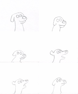
Here are the flip book animations that demonstrate squash and stretch and to some extent follow through and overlapping. I tried to make the curtains in the second animation seem like the bottom of the curtain trails behind slightly.


In the animation of the dog i tried to take into consideration the principle of anticipation, with the dog preparing to bark.


If i were to improve these animations i would add more frames so that the movements seem more fluid and not as jumpy. I feel i have grasped the importance of taking into consideration the principles of animations.


Pixelation - (OUAN403)


Pixelation - Storyboard Development (OUAN403)


12 Principles of Animation - (OUAN403)

The twelve principles of animation include the following:

Squash and Stretch; this principle gives the illusion of weight and speed, for example a bouncing ball may squash in shape when it hits the floor,stretching back into shape when it becomes airborne on the way back up.

Anticipation; anticipation communicates what is going to happen, for example when a character goes to jump, they bend their knees to build up the energy in order to jump - this is anticipation. you could argue that for every action there is anticipation.

Staging; staging gives us the ability to communicate the mood of a character/ scene, to communicate one idea at once and to enhance the atmosphere you are trying to cultivate through shot framing etc.

Straight ahead & Pose to Pose;  straight ahead animation is animation that does not have key frames for the animator to follow and the animator makes up the movement of an object/character as he/she goes.
Pose to pose animation is animation that makes use of key frames, certain points in an object or character's movement that are extremes of that given movement e.g at the beginning, middle, and end points of a character jumping.

Follow through & overlapping action;  this is when the main body of an object or character has stopped moving and things like hair, limbs, clothing, string etc carry on moving in the same direction for a short duration of time.

Slow out & Slow in;  as an action begins more frames are needed at the beginning to show the movement speeding up, this is also true for the end of an action whereby more frames are needed to show the momentum decreasing in a movement. A good example of slow out & slow in would be an animated pendulum swing.

Arcs; ALL actions follow an arc or a circular path

Secondary action; a secondary action is an action that reinforces the effect of the first, an example of this could be the sneeze after the initial build up.

Timing; a mixture of low and fast timing can add texture and interest to an animation, however this can only really be perfected through practice and experience.

Exaggeration; exaggeration does not have to be large exaggerated movements, it is possible to exaggerate things like, a character's mood very subtly with subtle changes in expression

Solid Drawing: It is essential to have a good level of technical competence when it comes to drawing. This makes things more believable with things like depth, size and scale.

Appeal or Character Personality; a character needs to have a certain charm/likeability to keep the audience interested.


Monday, 19 October 2015

Identify - 'Montage of Heck' (OUAN403)


There is a somber, chaotic and dark feel to these animations of kurt cobain's journal entries and drawings that give the audience an intimate look into his thought process, even if it is only another persons external interpretation of how kurt might want his drawings to move, if he wished for them to move.
i think the feelings that are emoted while watching the rotoscoped segments of the film, come over due to the way the actions on screen seem to have more expressive qualities to them than if we were just watching normal video footage.
the animations of Cobain's journals are almost brought to life by giving the effect on the drawings and writing by having them appear on the page accompanied by the sound of a pen scratching the paper.
There is an attention to detail with the use of diagetic and non-diagetic sounds that makes the rotoscoped animation seem very  believable.
i believe the directors of this film wanted to communicate the message that kurt cobain was a troubled creative person who was; brutally honest, expressive, yet consumed by insecurities and scared of ridicule.

Friday, 16 October 2015

Identify - 'A Funk's life' The Mighty Boosh (OUAN403)


This animation is composited of artwork by noel fielding, the artwork has a painterly aesthetic to it, which considering noel is primarily a painter could mean that noel painted each component of the animation but then the production team assembled his illustrations into a cohesive animation.
due to the media that the animation is in it feels very flat, having said that there is a very vague sense of depth due to the background and foreground scenery. 
from watching the animation closely i can see that any elements which move, e.g character limbs will have been rendered digitally individually.
the aesthetic of this animation is quite psychedelic, a reason for this would be that the series that this animation features in - The Mighty Boosh - has within it a lot of avant-garde  story telling involving the realms of fantasy, mythological creatures and characters with references to pop culture and icons such as; Brian Ferry, Gary Numan, Boosty Collins, Etc. References in the show are dependent on the context of the storyline and what themes are being explored within an episode.
The storyline of the animation describes the rise and fall of the popularity of funk music, characterising funk as an extraterrestrial entity/creature 'a funky ball of tits from outer space' that was lost on the 2nd of july 1979 by George Clinton- so there is also some light hearted social commentary within this animation/series.
i think the animation was used to communicate this storyline as it is so imaginative and based in the realm of fantasy that it would be difficult to effectively produce it on set with actors and props. Another reason i believe the creators of the show opted for animation is that the animation is of an anecdote that the character previously on screen narrates, the change in the media of the moving image also keeps the audience captivated.

Wednesday, 14 October 2015

Identify- 'Plaid - itsu' (OUAN403)


This music video incorporates motion graphics, live action& pixelation. the themes that i can detract from this are corporate culture, neo-liberalism, and the sense that we are still in a patriarchal society.
the characters in the music video at times show exaggerations in their character that are subtle to begin with but progressively become more obvious to the audience, which inherently, are going to be fans of the artist who created the music.
There is a sequence in the video whereby the character doing the corporate presentation, is shrink wrapped, much like a piece of meat. this refers, i think, to the previous sequence of 'corporate suits' being dressed in pig masks. almost as if the message being communicated is that through they're greed (the pig representing greed), they have become the very product they are selling the video makes clever use of the synchronisation of the music, as towards the end of the music video the music hs glitchy effect sounds that, when combined with pixelation are effective at portraying the dark, self destructive undertones that are present in this piece of communication.
The video exhibits a restricted colour palette throughout the video to keep the theme of the video consistent.

Friday, 9 October 2015

Storyboard - (OUAN403)


Here is my final storyboard. I decided to colour code the camera actions and the sounds that you would expect to hear, a key at the bottom deciphers this.

If I was to change this storyboard in any way I would add the actions of the characters on screen and label the different types of camera shots to make it easier for people looking at the storyboard to understand what it is that is being communicated.

I think it would also be interesting to pick out a few certain stills to develop them further, to give more of a sense of the atmosphere etc.


Thursday, 8 October 2015

StoryBoard Development - (OUAN403)


At this point of development I had completed more stills for the storyboard than intended, hence why these five stills do not feature in the final storyboard design. If I have time I may carry this story on further to perhaps produce a simple animation form the planning that I have already generated.

Also at this stage I wanted to reflect on how I could make the the shots better, how they might flow together better and how I might communicate effectively what it is that is happening on screen in terms of camera actions and also the actions of the different characters.
Storyboard Development 2 - (OUAN403)


Here are my initial thumbnails for the 'bottomless pit' idea whereby Humpty falls down a well, the king and his men fail to save him and after his fall, Humpty is approached by some shadowy figures at the bottom of the well.

The idea of the well played a key roll in introducing some interesting perspective shots to the storyboard, aswell as the landscape providing some variation in the distancing of shots, with extreme long shots as establishing shots and some medium to extreme close up shots focussing on the characters in the story.

I also added notes for what actions i would like the camera to play out on screen e.g zoom out, pan etc.